Leave your comfort zone
Vivamayr is more than wellness.
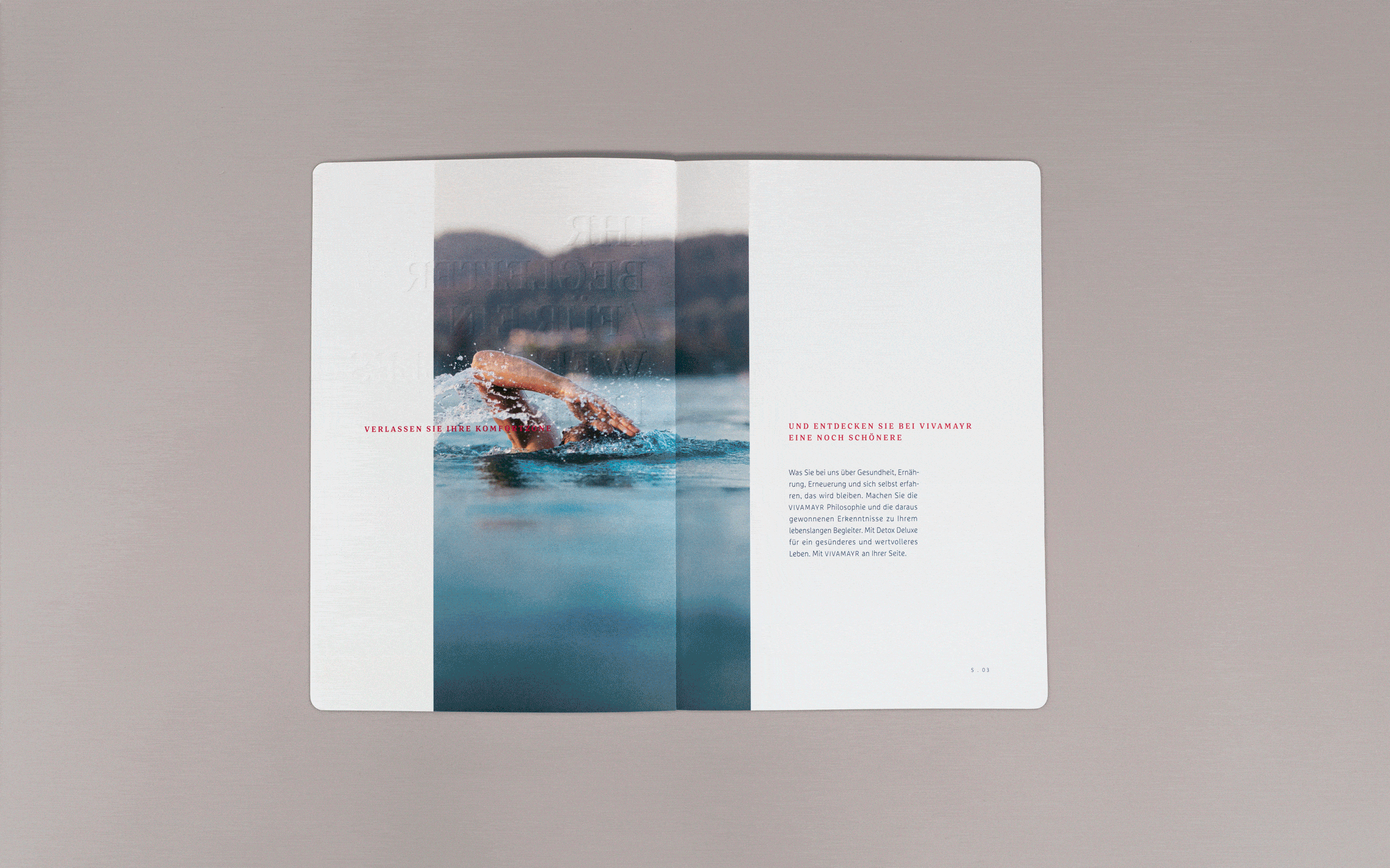
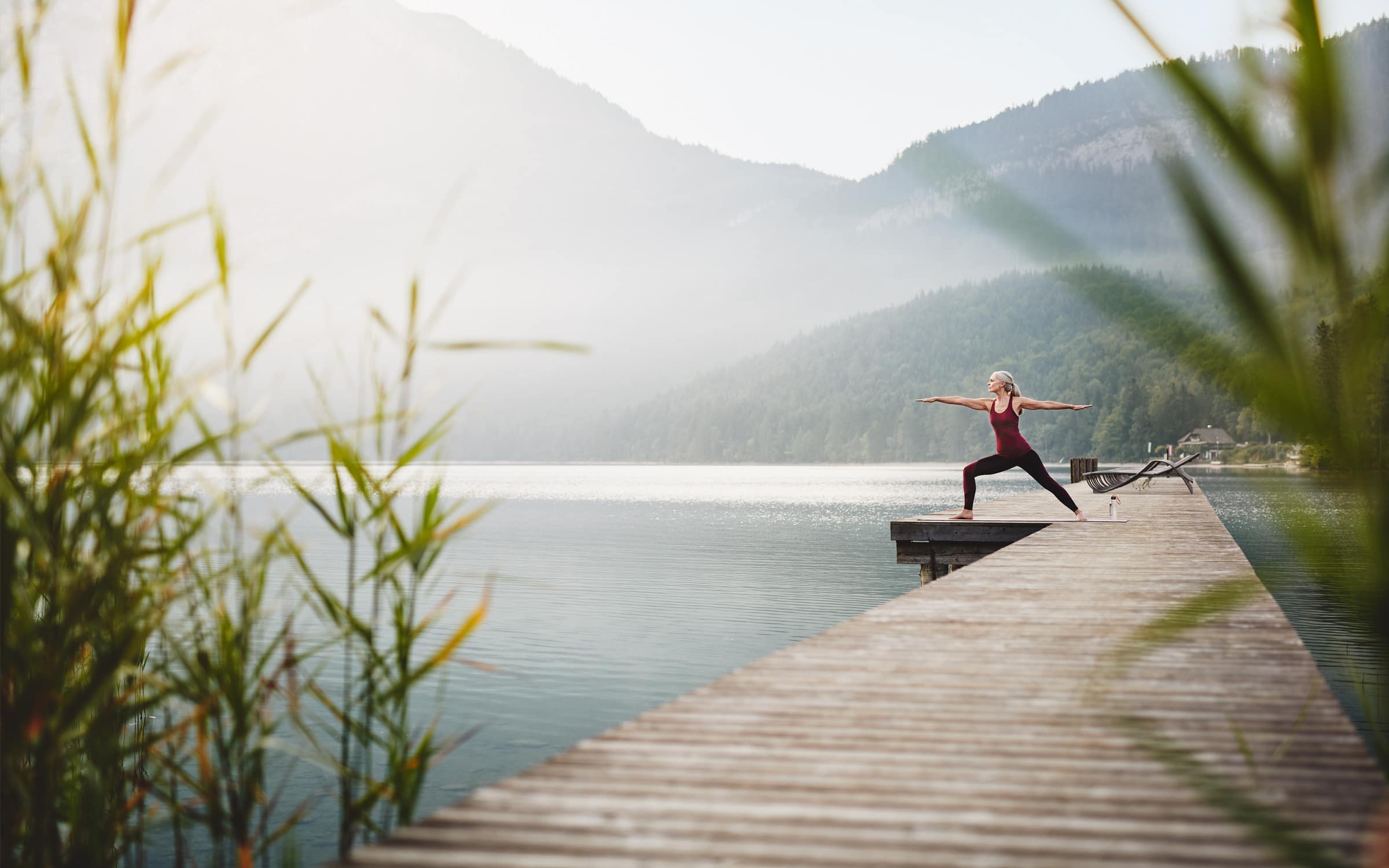
Vivamayr stands for a lifestyle. The medical centers in Maria Wörth and Altaussee are places of contemplation and reflection, where guests find new strength and unexpected vitality.
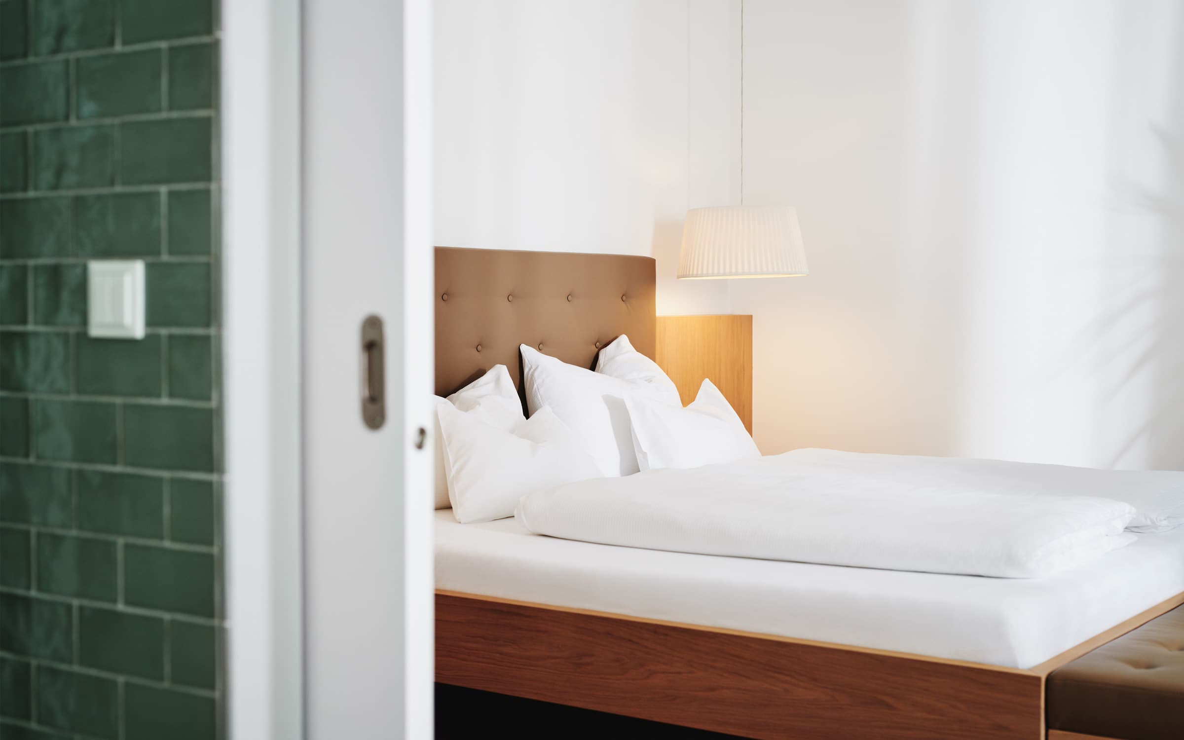
Vivamayr communications are direct and streamlined. In this way, their image folder is transformed from a purely informational medium into an inspiring companion that actively and subtly motivates people to take the first step toward a new, better life. The image pictures feature the natural and powerful atmosphere at both hotel properties.
Anna Kronthaler
(Graphic Design)
Sandra KTG
(Art Direction, Graphic Design, Portfolio-Photography)
Sergej Ritter-Höntzsch
(Creative Direction)
Saskia Ritter-Höntzsch
(Editorial)
Christoph Angerer
(Text)
Michael Königshofer
(Photography)
petrichor
(Brand Strategy)


Image brochure with added value. The idea of a “companion” begins with the medium itself: the brochure must be so aesthetically convincing that people want to keep it and show it as a constant brand reminder.


The brochure encourages readers to deal with their current lifestyle: Provocative questions from Vivamayr themes are showcased on the shortened blue pages. The blank, white fields encourage guests to write in their answers to these questions by themselves or with Vivamayr by their side.


Lifestyle instead of wellness: With a double brand of detox & cure, Vivamayr managed to shed its wellness image and position itself clearly as a health hotel and life companion. The brand values of “lightness, consistency, life-enhancing and valuable” are visually expressed at touchpoints like the image brochure.


Readers cannot imagine an easier life if the text is overwhelming. We reconciled the customer’s desire for a comprehensive brochure with the brand values developed by our strategy partner, Petrichor. The courage to be “less is more” paid off: the text and design are clean and direct, free of unnecessary weight.
