Start living
Tauernhof delights, inspires, and invites its guests to discover the beauty of Grossarl: down-to-earth, lively, and informal – just like their hosts.
After strategic realignment and a year of intense renovation, the hotel reopened in July 2021 with a new, contemporary look thanks to modernized architecture and brand design.
The creative guiding principle “feel real moments” is the basis for all implementations: colored natural papers from Gmund are finished with letterpress for a tactile experience. Scribble-style illustrations loosen up the design. The color world is inspired by Grossarl’s “green valley of the alpine pastures.” The brand’s signet is the larch cone (a four-season coniferous tree that is particularly common in Grossarl and only grows in places with very clean air). Together with matching traditional costume icons, the signet is part of the brand pattern on fabrics and the hotel signage.
Hotel Tauernhof Großarl
www.tauernhof.com
2019—2022
Hospitality
Salzburg State Prize 2022
2nd place, POS & Messebau
Stefanie Aunitz
(Graphic Design, Illustration)
Anna Kronthaler
(Graphic Design, Illustration)
Dominik Langegger
(Project Management, Creative & Art Direction, Illustration, UX Design)
Saskia Ritter-Höntzsch
(Content Strategy, Social Media Management, Editing)
Sergej Ritter-Höntzsch
(Creative Direction, Signage)
Matthias Tildach
(Graphic Design, Photography, Portfolio-Photography, Signage)
BlueChip
(Web Development)
Bianca Hochenauer
(Photography)
Valerie Maltseva
(Portfolio-Photography)
petrichor
(Brand Strategy)
Stephan Riefer
(Text)
WG3
(Interior Design & Architecture)
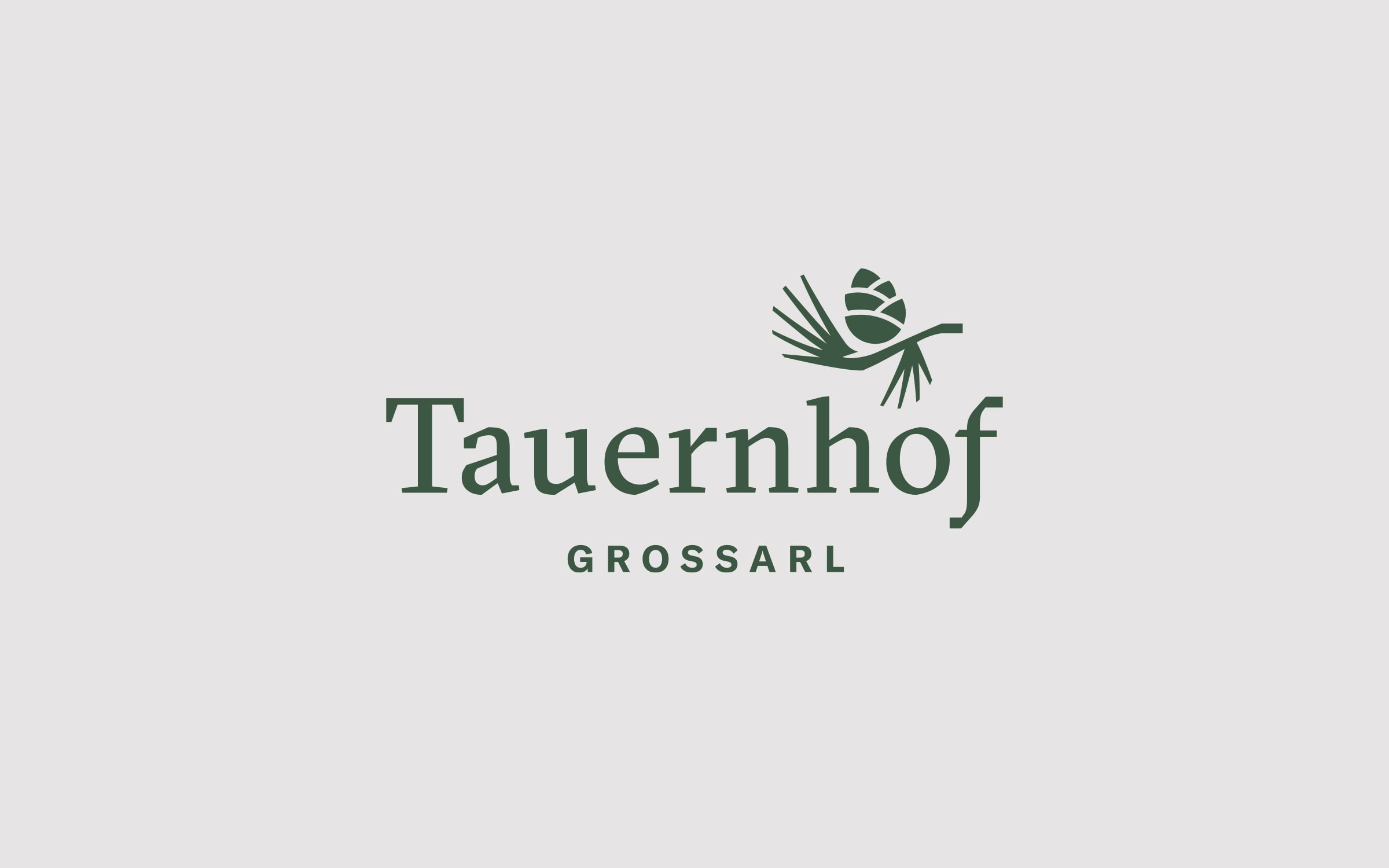
Großarl is known as the “green valley of alpine pastures.” Nature is characterized by lush and diverse vegetation. One tree stands out: the larch and the inspiration for the Tauernhof logo: what is special about this coniferous tree is that, unlike its relatives, it changes its look with the seasons. The larch only grows in places with excellent air quality and is also a traditional, popular building material in the Alps. Qualities that characterize the larch are found in the Tauernhof: traditional, authentic, and liveliness are brand values communicated by this signet.


As a Tauernhof guest, you feel ‘real life moments’ at every touchpoint with the brand — literally, because the company’s printed products are produced sustainably while providing a tactile experience with the finest Gmund paper. The uncoated, fully-dyed paper is refined with letterpress to create a more sensory experience.


The Tauernhof’s brand story refers to the hotel’s strong regional connection. The brand design visualizes this connection with a contemporary reinterpretation of the local and traditional costume symbols, seen repeatedly in interior and other design applications.
Scribble-style illustrations adorn various implementations and convey the hotel´s personality through their easily accessible visual language.


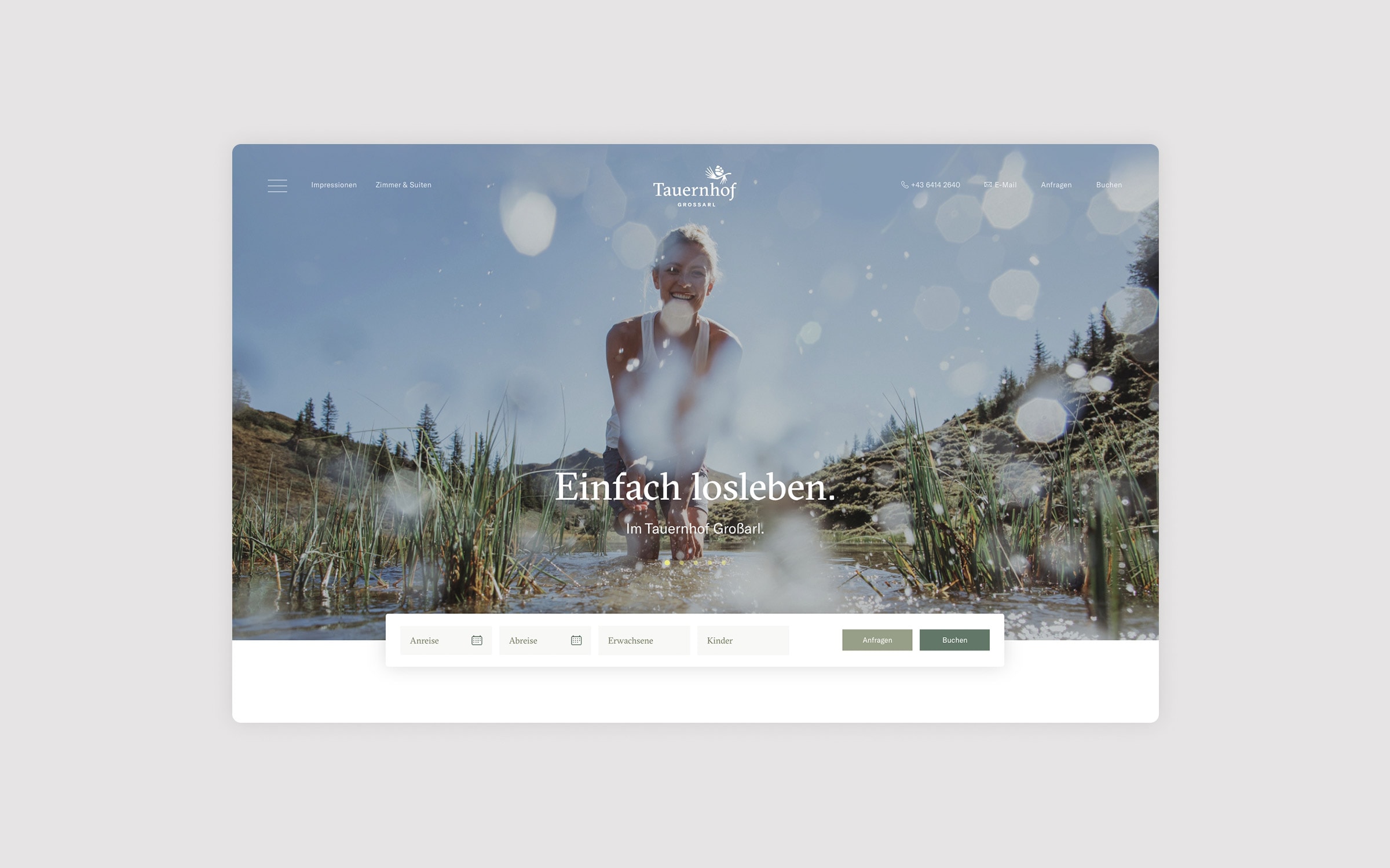
The website serves as a one-stop shop for all guest web users. Much more than a “digital reception” — it is an effective marketing tool.
Thanks to simple user guidance and smart programming, the booking process is easy. The site is structured to advertise the hotel’s key features in the best possible way via SEO and SEA.


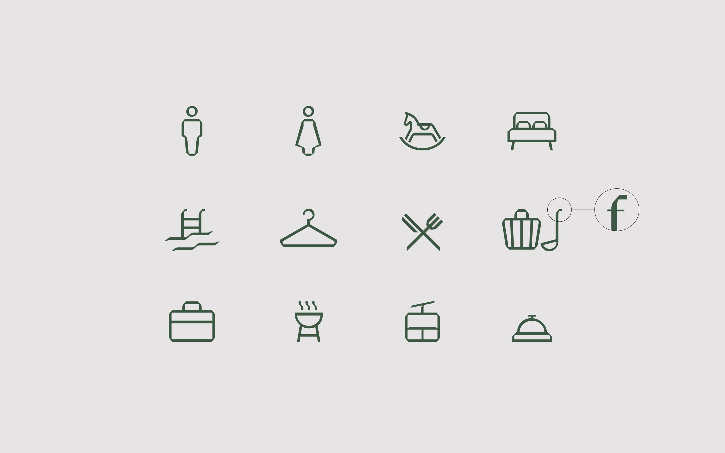
In hotels, it is important that guests find their destination quickly and without detour. Thanks to Tauernhof’s friendly and clear signage, this is not a problem for holiday makers: the corridor signage and at pivotal junctions blend harmoniously with the interior design.
Matte-steamed larch wood blocks with matte black lettering and color-coded paintwork offer guests the best possible overview. As a visual contrast to the rustic-modern Alpine style, neon lettering with matte black, powder-blasted, and side-reflecting steel signs complete the route. The Taurernhof signage was awarded 2nd place in the 2022 Salzburg State Prize.


With the claim “Just start living” Tauernhof promises their guests real holiday joy as reflected by the imagery.
Real, authentic moments are revealed in a documentary style in and around the hotel. They inspire guests to simply “just get going” themselves and explore the Grossarltal. With several photo shoots, a large pool of images was created for all of the hotel’s communication channels.
Advantage: Marketing does not rely on local tourism association materials since they advertise with their own exclusive imagery. Now the hotel distinguishes itself from the competition with original content.