Don’t be like the rest, Darling!
Standing apart from classic strategy consultants requires courage and a more creative understanding. Petrichor proves this in its brand design and website.
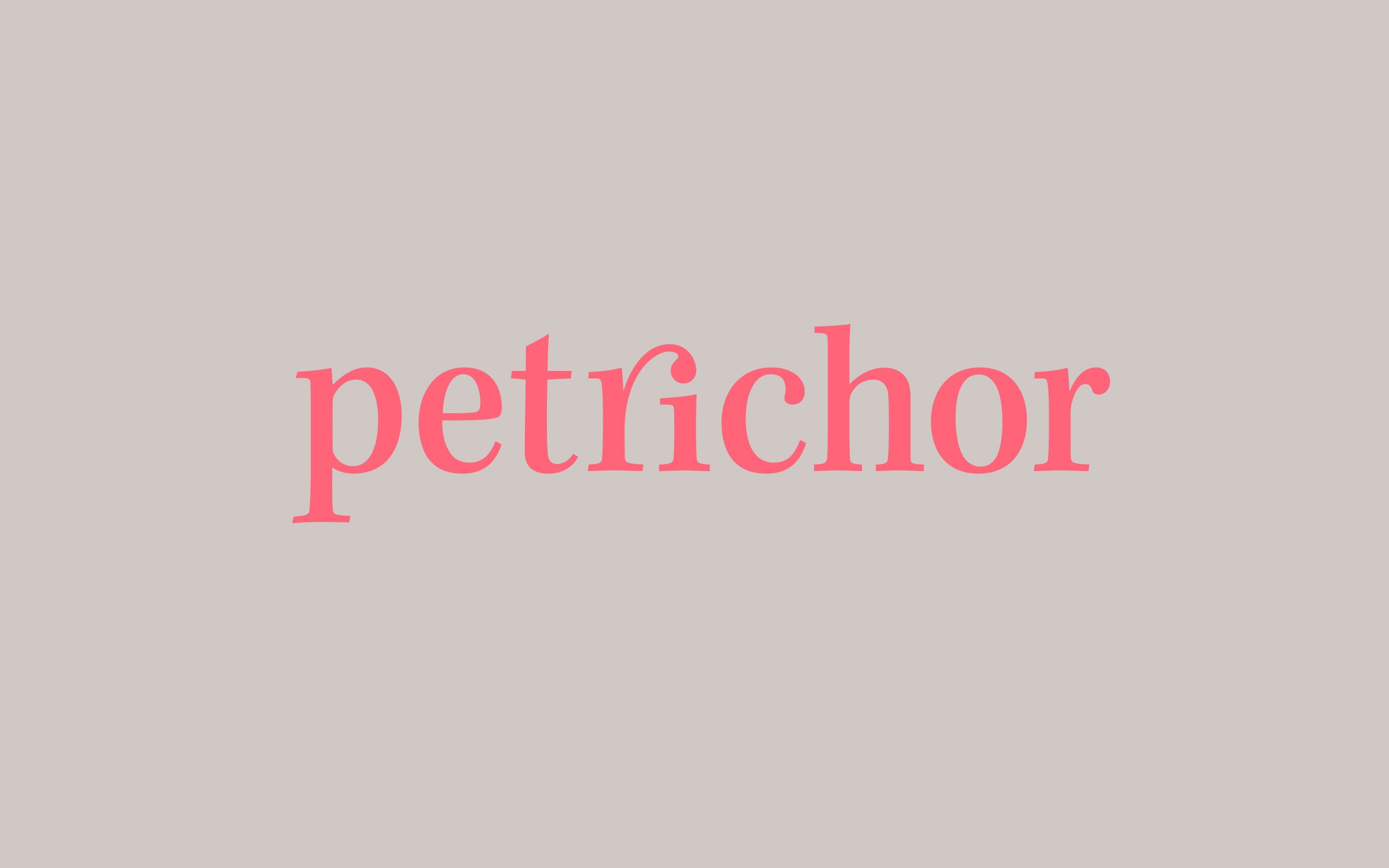
The name Petrichor translates to “the scent of rain on dry earth.” It becomes visible through the tight brand design: the drop symbol forms the guiding principle of the design line. In the logo with the ri-Ligature, and iconographically with the essence that meets the fertile ground. House colors are a combination of strategic blue with inspiring “hot coral red.”
petrichor
www.petrichor.at
2018
Strategy Consulting
German Design Award 2020
Winner, Brand Design
Sandra KTG
(Art Direction)
Sergej Ritter-Höntzsch
(Project Management, Creative Direction)
Michael Königshofer
(Photography)
petrichor
(Brand Strategy)
Alexander Sellas
(UX Design)

Petrichor sets a good example for their customers: If you want to distinguish yourself in the swamp of the competition, you have to be braver! The new brand design is structured and clear without sacrificing precision.


What if the Pantone universe is not big enough? We had to search, and together with our screen printing partner, we developed the new corporate color “pop coral”.


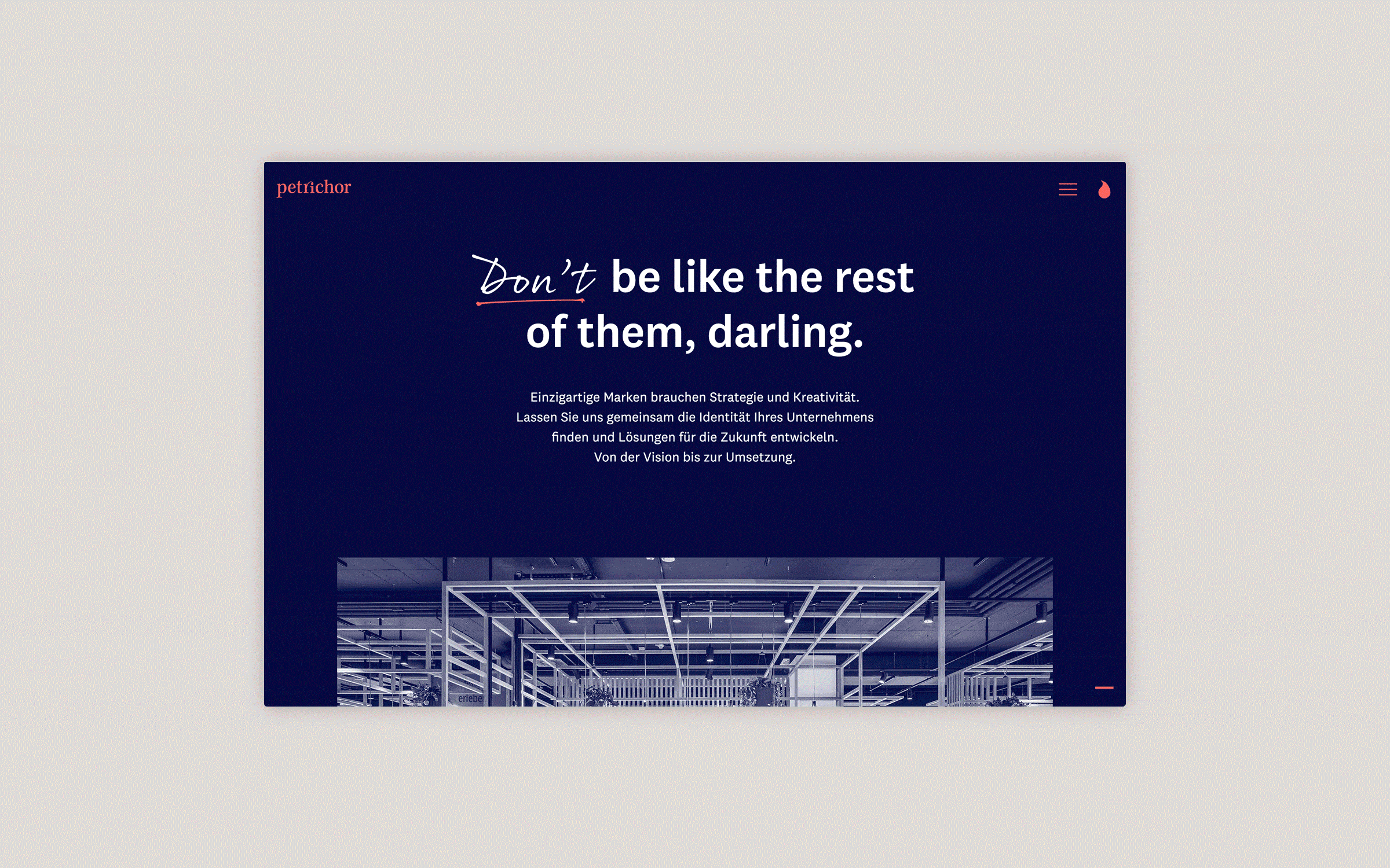
The challenge was to give the company’s information-rich material a human component. This gave rise to the idea of a game with handwritten characters, accents, additions, and emphasis. This game comes alive with animations that are triggered while the user follows the website‘s linear reader guidance. This creates a playful tension in the user experience.


The linear reader guidance paired with intelligent texting leads the user through company insights, competencies, and stories. The user is seamlessly transferred from chapter to chapter – without having to use the menu.
