Built to the point.
With their brand story, they simply get to the point: Monvest are young guns with old values in the Munich real estate market. They proudly show this in the new brand design, proving that real gentlemen and women never go out of fashion.
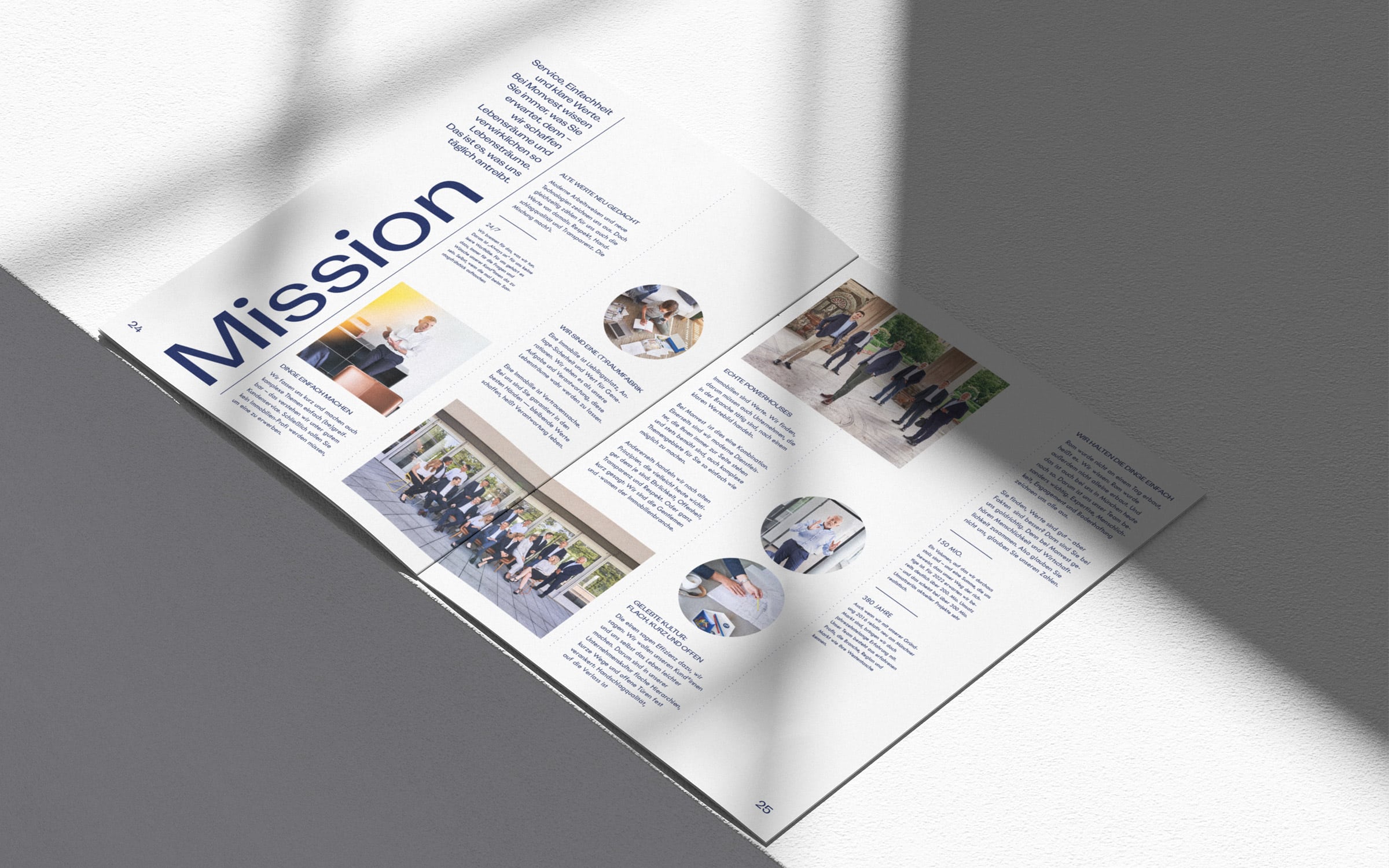
The Monvest team is united in a common goal to make things easy for their customers. They do this by managing expectations and future details prior to construction. Monvest goes the extra mile to help customers find a Munich dream property. As promised in the claim — built to the point.
These brand values represent the people behind the project developer: real gentlemen and women, inspiring the entire brand design throughout.
Sibel Koyuncu
(Social Media Management)
Sandra KTG
(Art Direction Photography)
Dominik Langegger
(Project Management, Creative & Art Direction, UX Design)
Saskia Ritter-Höntzsch
(Content Strategy, Social Media Management, Editorial)
Sergej Ritter-Höntzsch
(Brand Thinking & Narrative, Creative Direction)
Matthias Tildach
(Graphic Design, Photography)
BlueChip
(Webdevelopment)
Elias Hassos
(Photography)
Stephan Riefer
(Text & Brand Story)
Thomas Sonnenmoser
(Coaching)
Investing in real estate is one of life’s major decisions, laying a solid foundation. This premise led to the idea for the Monvest name: the Latin “mundus” for “world” combined with “investment” — an investment in my own world/life. This creates a new brand name that rolls off the tongue and easily permeates the collective mind.


The Monvest team sees itself as the gentlemen and women of the Munich real estate industry: openness, transparency, and making real estate transactions as easy as possible are the values of the company and the core of their brand story.
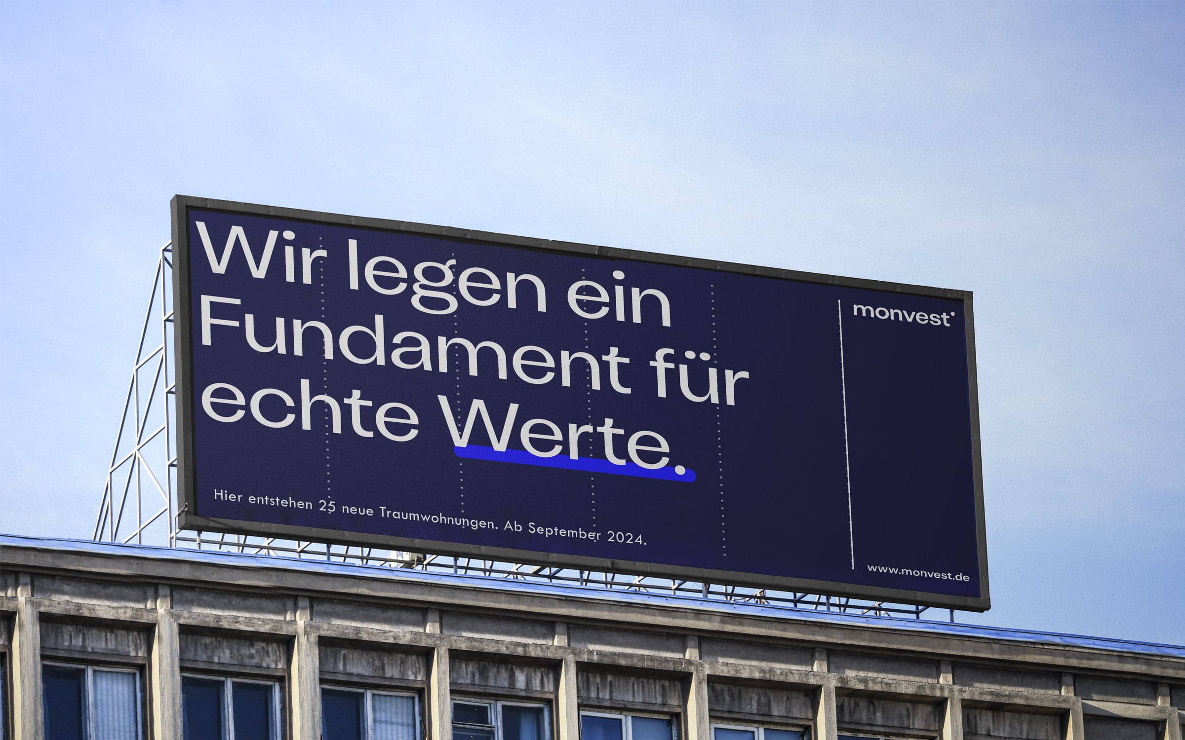
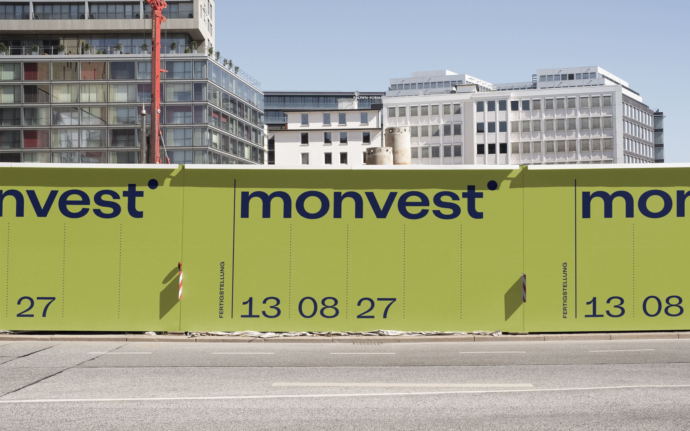
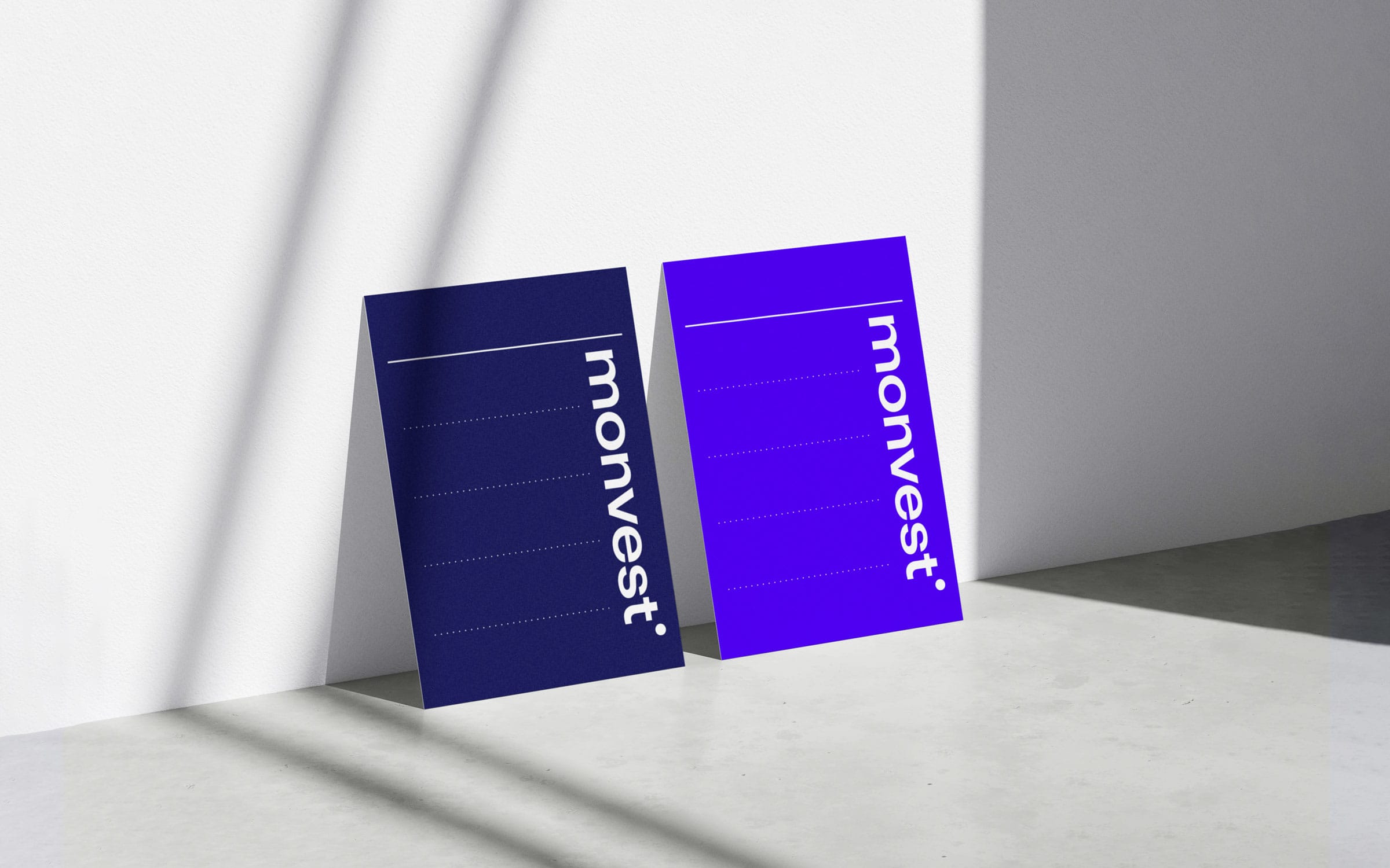
The pinstripe – the insignia of the modern gentleman – is translated into the design grid on which all implementations are based.

Approachable AND professional: The Monvest team portraits span the gap between the two poles and present the ladies and gentlemen in the best possible light. In our photoshoot, we created a set-up that others can easily reproduce when new collaborators join.


The social media templates we developed ensure a consistent look for all channels. Image material was produced in a specially planned photo shoot to expand the content pool to complement the brand story. This is essential editorial planning and is, therefore, the ideal marketing tool.

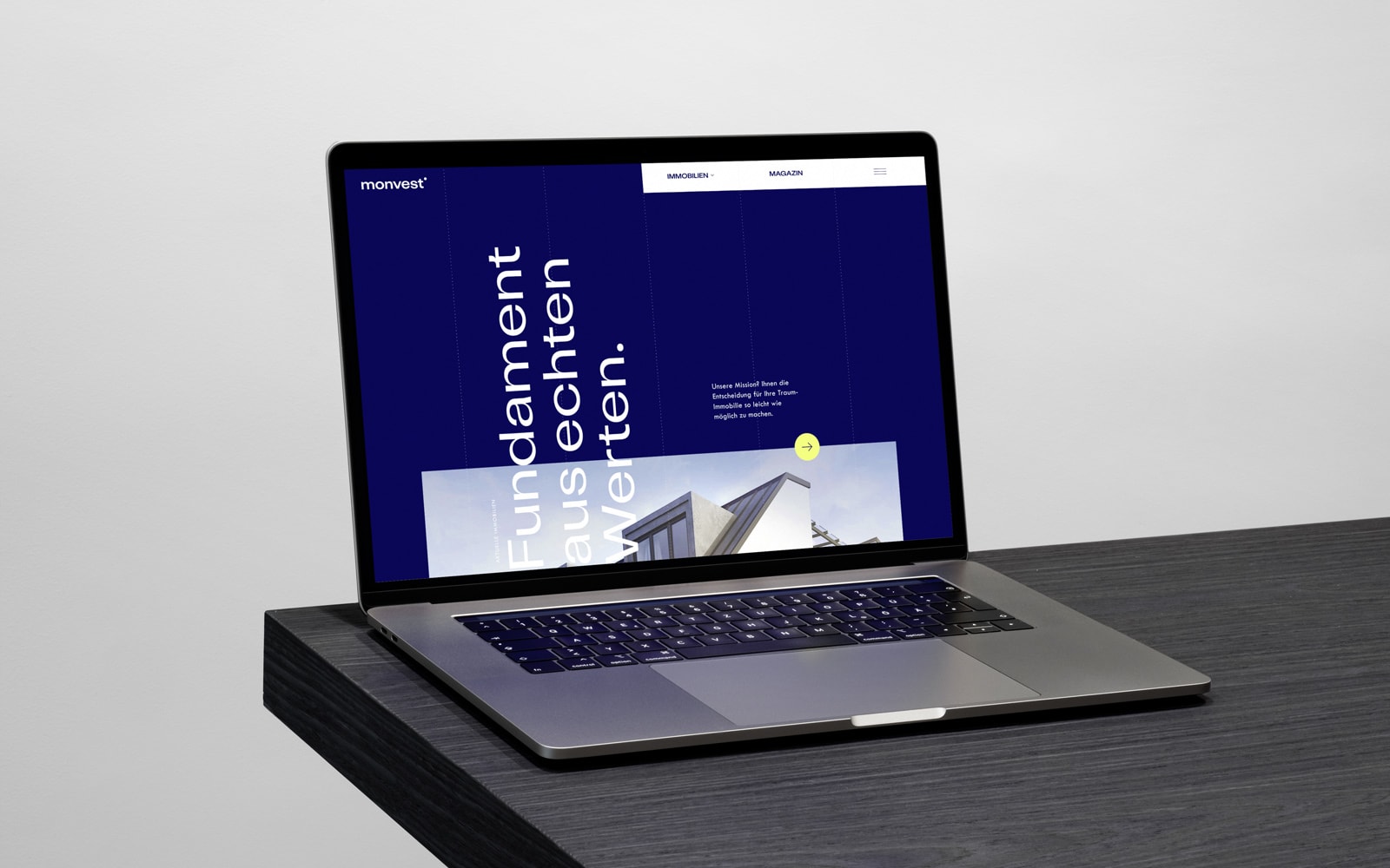
The Monvest website shows current construction projects and serves to build the company’s image. Transitions and text animations create a lively user experience that invites you to discover the brand.
Written for people: web texts are SEO-compliant without losing a certain esprit and linguistic quality – ensured by the Tone of Voice developed for Monvest. It defines the personality of corporate language and provides a guide for those who represent the company.


The claim “Built to the point” is taken literally in the design. The dot can be found in all design elements — in the dashed grid, in the iconography, or as an eye-catcher in the layout. This is how we simultaneously create a simple and strong visual language that ensures recognition.