200 years of tradition
Since 1807, the Apothecary Bad Ischl has supplied the Salzkammergut people with in-house specialties while delighting tourists and culture lovers from all over the world. The new brand design proves that tradition and modernity go hand in hand.
The brand design bridges the gap between tradition and modernity: the combination of historical and modern elements in the typography, color scheme, and design language brings the brand into 2021 and beyond. A simple but strict grid ensures a coherent presentation of information on labels and outer packaging.
Spa Pharmacy Bad Ischl
2019—2022
Health & Medicine
Anna Kronthaler
(Graphic Design)
Sandra KTG
(Art Direction, Graphic Design, UX Design)
Dominik Langegger
(Project Management, Art Direction, Graphic Design, UX Design)
Saskia Ritter-Höntzsch
(Editing, Proofreading)
Sergej Ritter-Höntzsch
(Creative Direction)
Matthias Tildach
(Graphic Design, Portfolio Photography)
Marion Kamper
(Illustration)
Valerie Maltseva
(Portfolio Photography)
petrichor
(Brand Strategy)
Stephan Riefer
(Text)
UX & Tollerei
(Web Development)


The Apothecary needed a coherent design system — for the brand and the product packaging for the more than 200 different in-house recipes. In the new brand design, we translate the historical heritage of the brand into the present. With simple but clear design principles, we maintain the apothecary heritage and speak a timeless and contemporary design language.


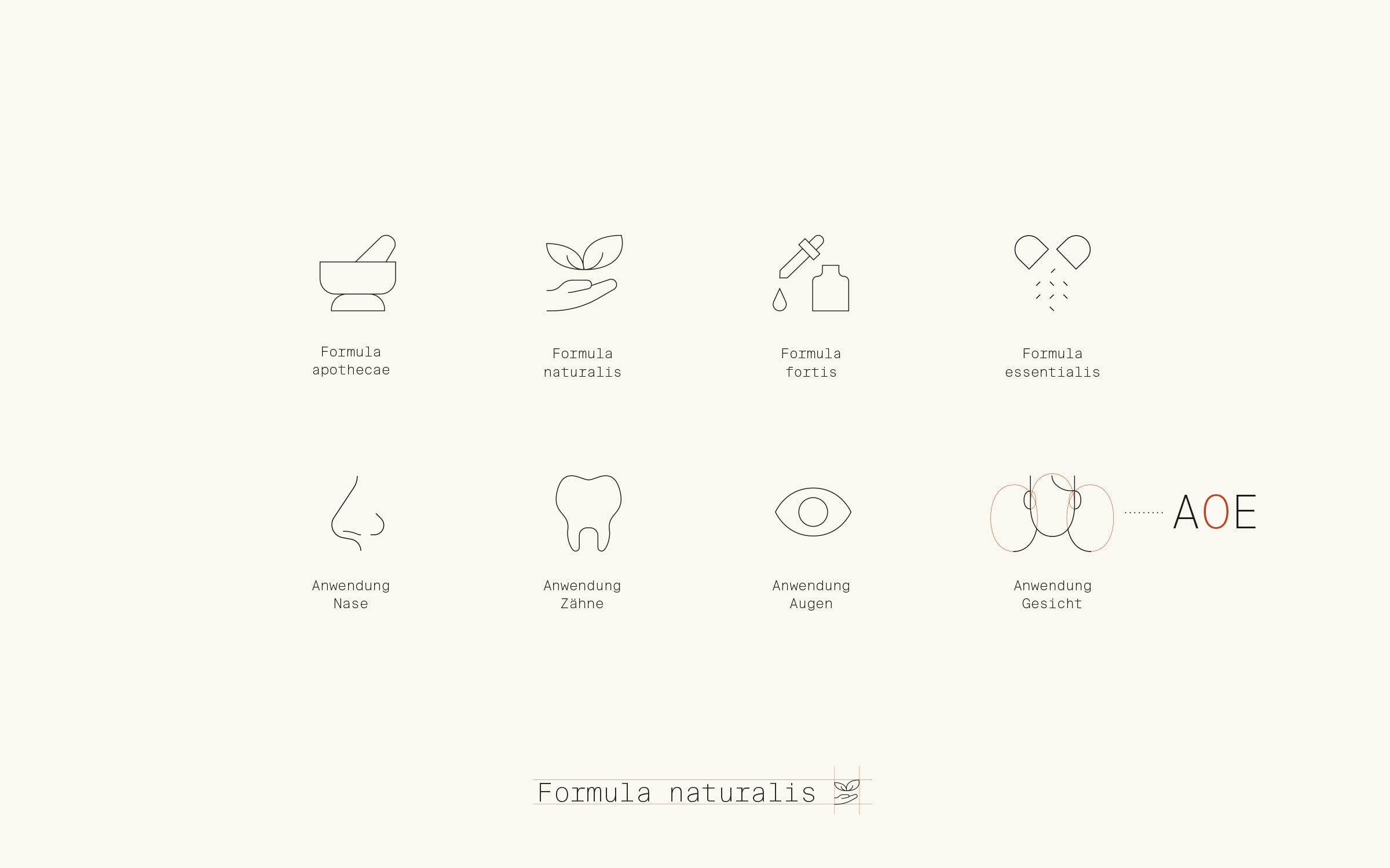
The brand’s design language celebrates Bad Ischler culture with an individual icon set, historic-looking illustrations, and a nostalgic brand pattern.
The icons are designed to complement the monospace font used to mark product information aesthetically. The icons become a part of the typography.


The Kurapotheke still produces over 200 in-house recipes, requiring diverse package designs. To do this, we developed a modular design system that works for all container shapes and sizes.
All labels are designed based on the same grid, allowing for quick adaptations like new labels and bringing products to market quickly without losing design consistency.


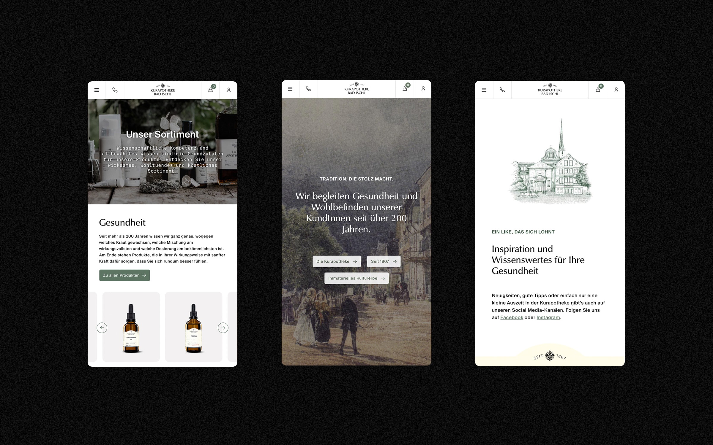
Online strolling: shopping and browsing become a digital brand experience on the new Kurapotheke Bad Ischl website.
The WooCommerce shop system is the site’s technical platform. Individually designed and developed modules expand the shop into an extensive image page. WooCommerce can be quickly and easily connected to your own merchandise management system, making it easy to manage orders, returns, and inventory control.


