Brand
Design
The best strategy is useless if you don’t come to the party. In brand design, we make your brand tangible for all the senses. To do this, we blend appearance with strategy and brand story. The result: an unmistakable brand identity.
Brand harmony is what happens when you blend all design elements: typography, sound, visual style, logo, and colors. A well-tuned, coordinated ensemble provides enormous added value for your brand and consumer experience.
Brand design services at a glance:
Brand Design Audit
Our Design Score Card examines how your current brand design ranks regarding form, function, consistency, impact, and differentiation. We will keep some of your substantial brand elements. However, others will require a refresh, and some elements may retire forever. We gather our findings in a report with tailor-made calls to action.
Creative Guiding Principle
The guiding principle is the bridge between idea and form. A central design idea must be a seamless transition from the brand strategy.
The creative guiding principle is tightly woven into the company mission, providing fertile ground for growth. It influences the definition of colors, shapes, images, material, and much more, guiding all brand design and future marketing activities. The guiding principle is an omnipresent source of inspiration.
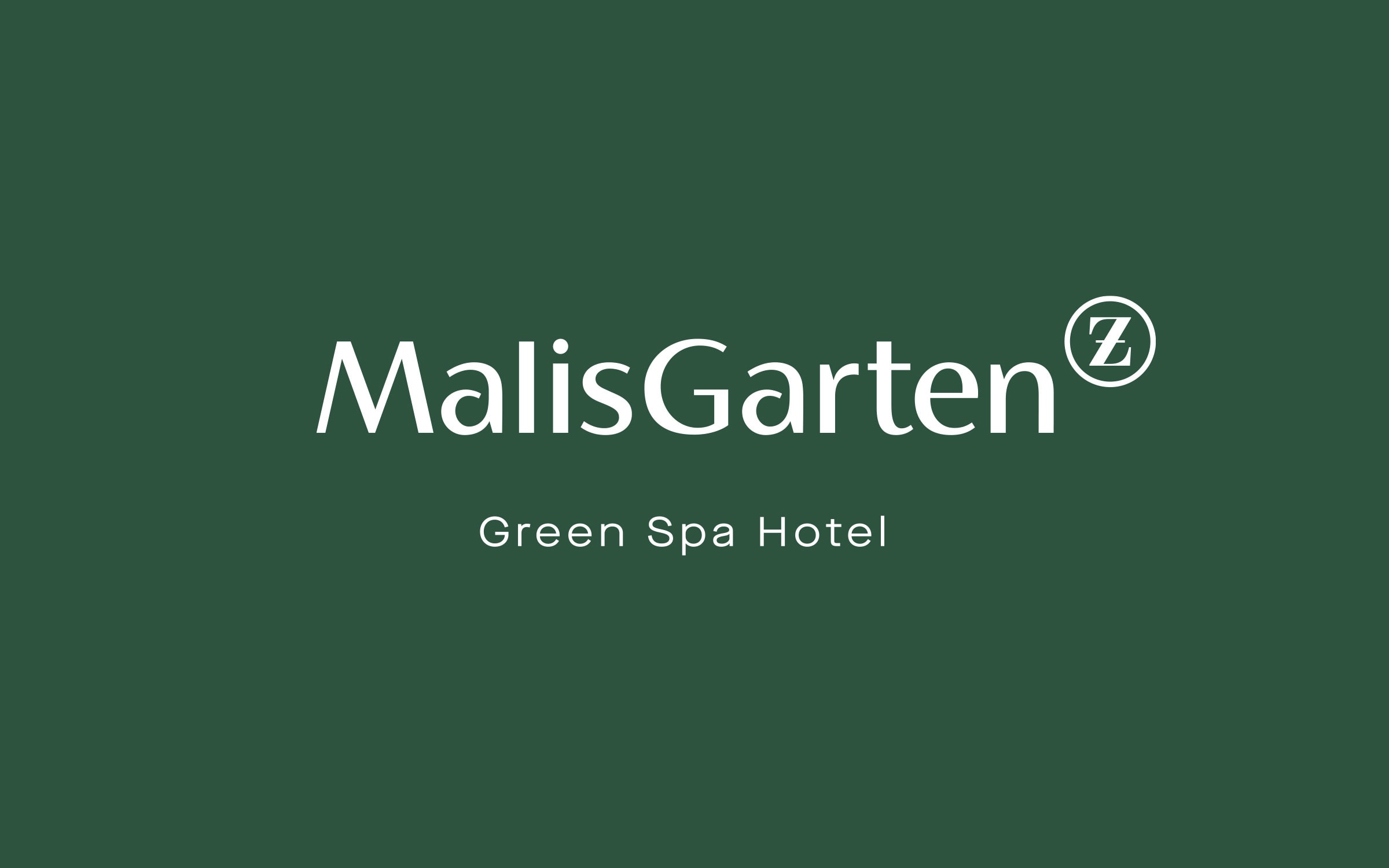
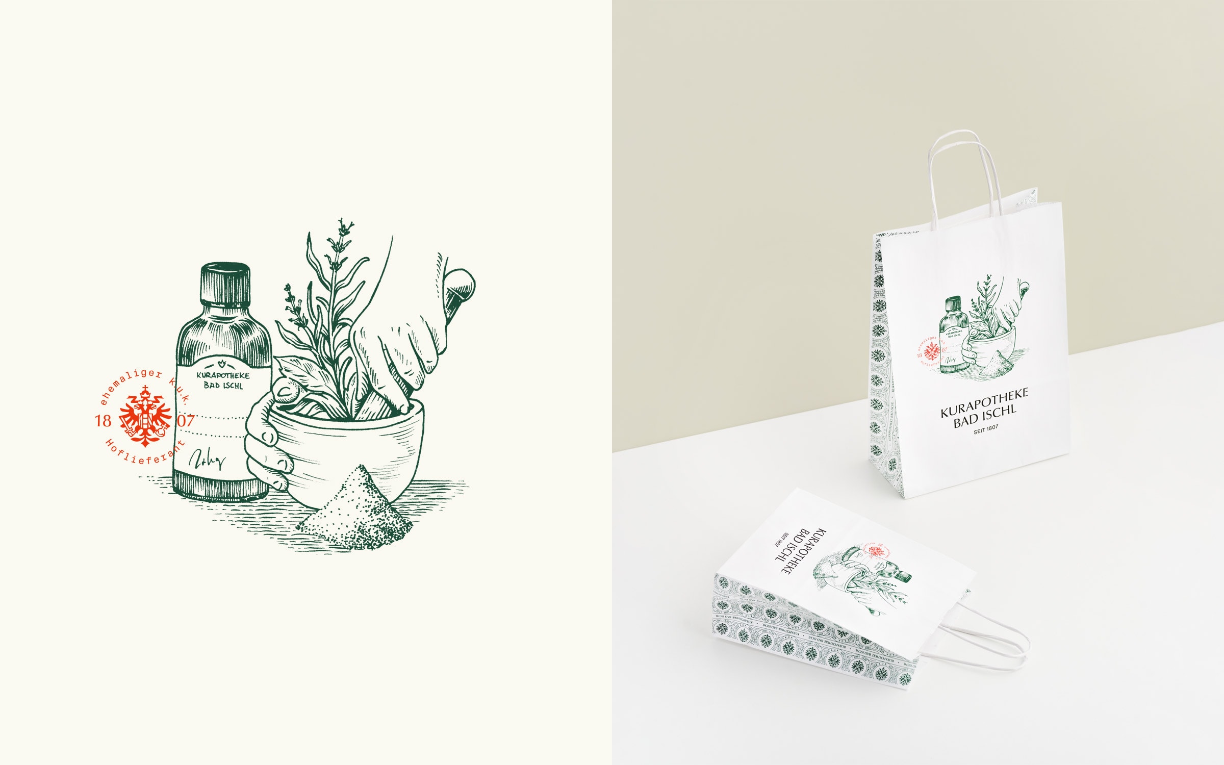
Logo and Trademark
Simple but effective: designing a logo is one of the most demanding tasks in brand design. You need a logo that works as a neutral touchpoint and integrates into digital applications.
A good logo is…
… unique in idea and implementation · recognizable, legible, and noticeable · timeless in formal expression · technically precise · committed to the creative guiding principle · flexible · scalable and reducible.

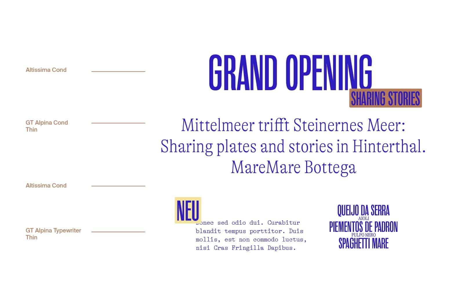
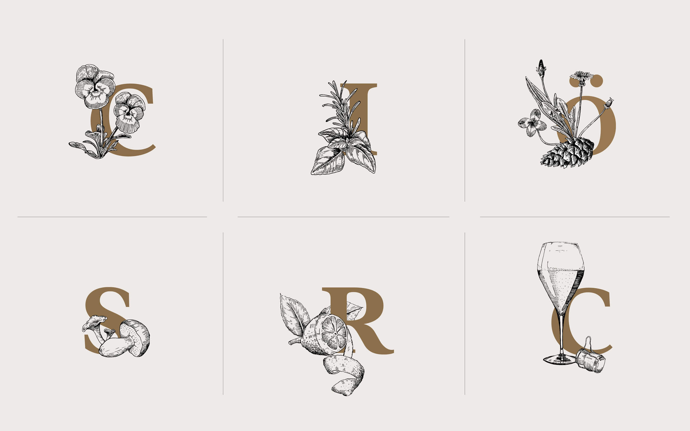
Typography
Letters with superpowers: your smallest brand ambassador gives your brand a distinctive face.
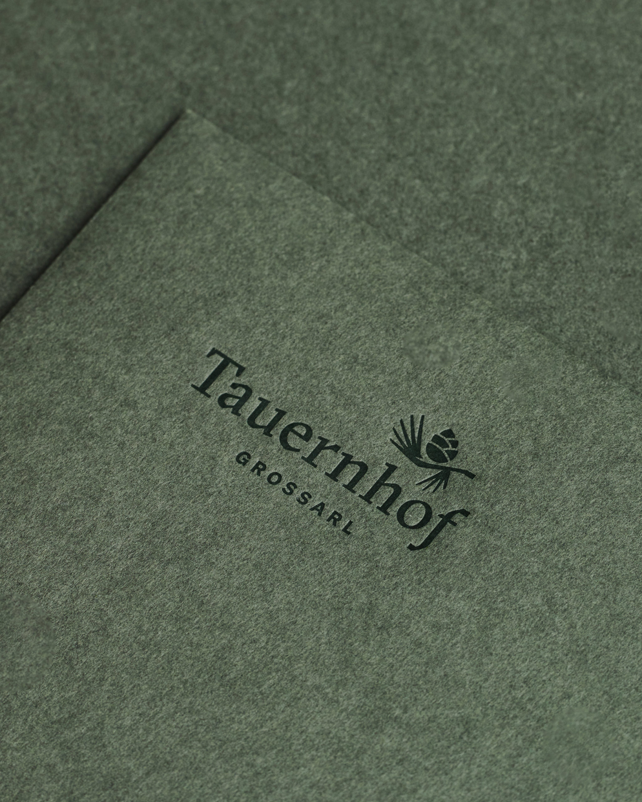
The “black art” known to book printers says a lot about your (brand) personality. With a corporate font, you create a consistent, recognizable appearance, letting your audience know whose world they’ve entered. Opt for an exclusive font (Corporate Typeface) or a font from a reputable font manufacturer – FYI … not the system fonts on your computer!

Hotel Enzian Obertauern
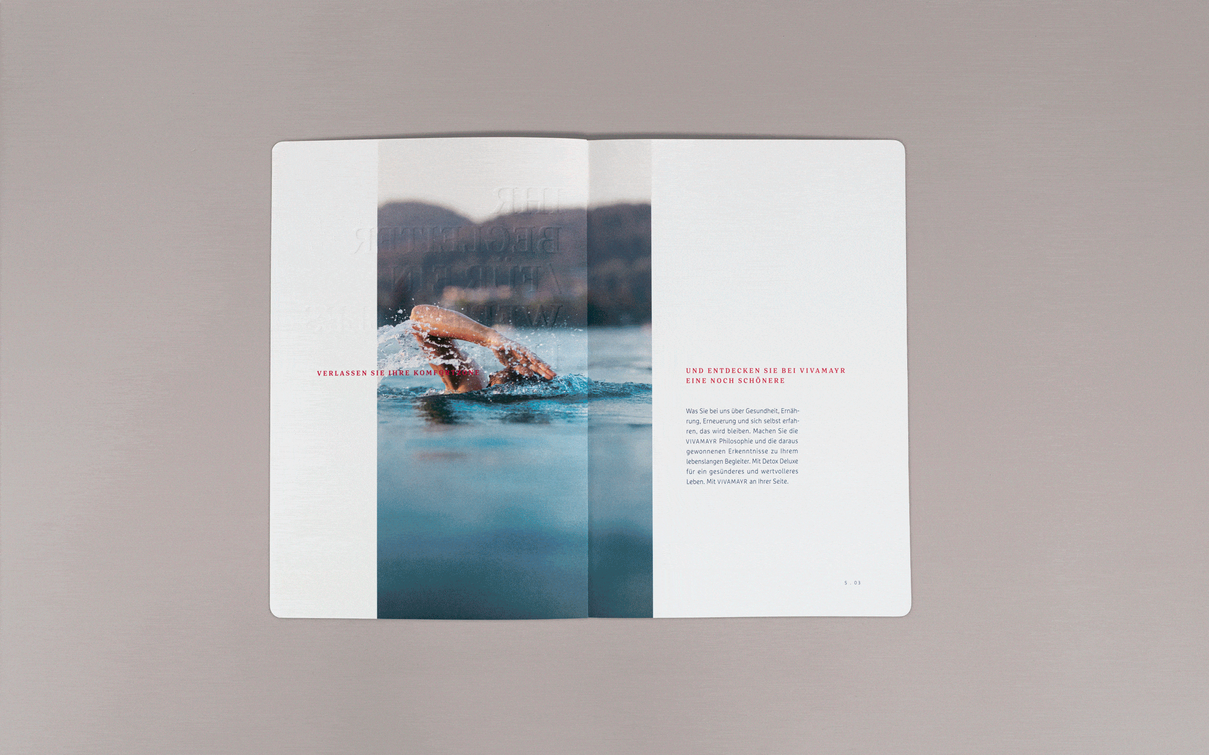
Imagery
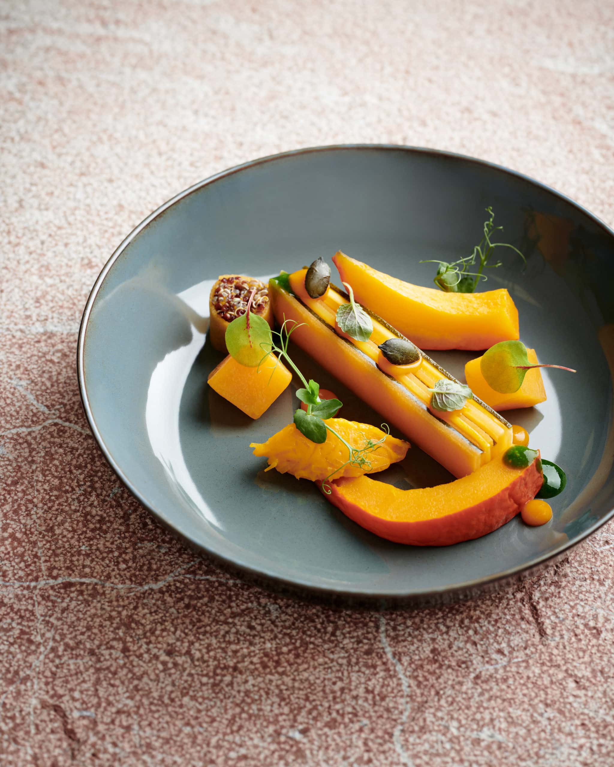
A picture is worth a thousand words. With short attention spans and social media, we can all agree that nothing works without pictures. Images work without text and often translate globally.
Images convey what your brand represents. Using your own imagery sets you apart from the flood of interchangeable images. You save time and money and get results in the spirit of your brand: Everyone involved can use these principles as a guide when acquiring images – whether purchasing pictures or a photo shoot.


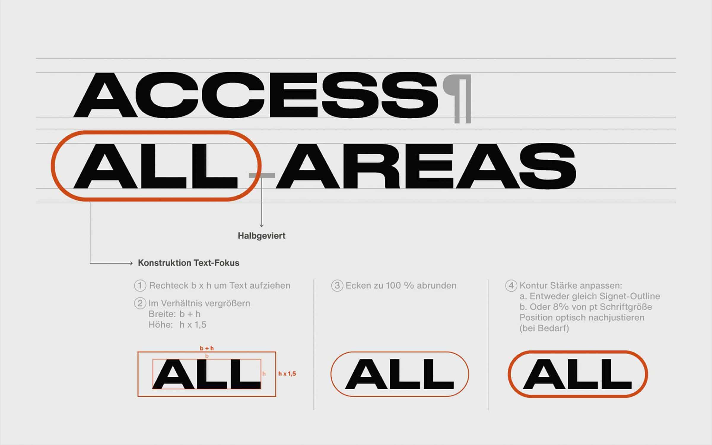
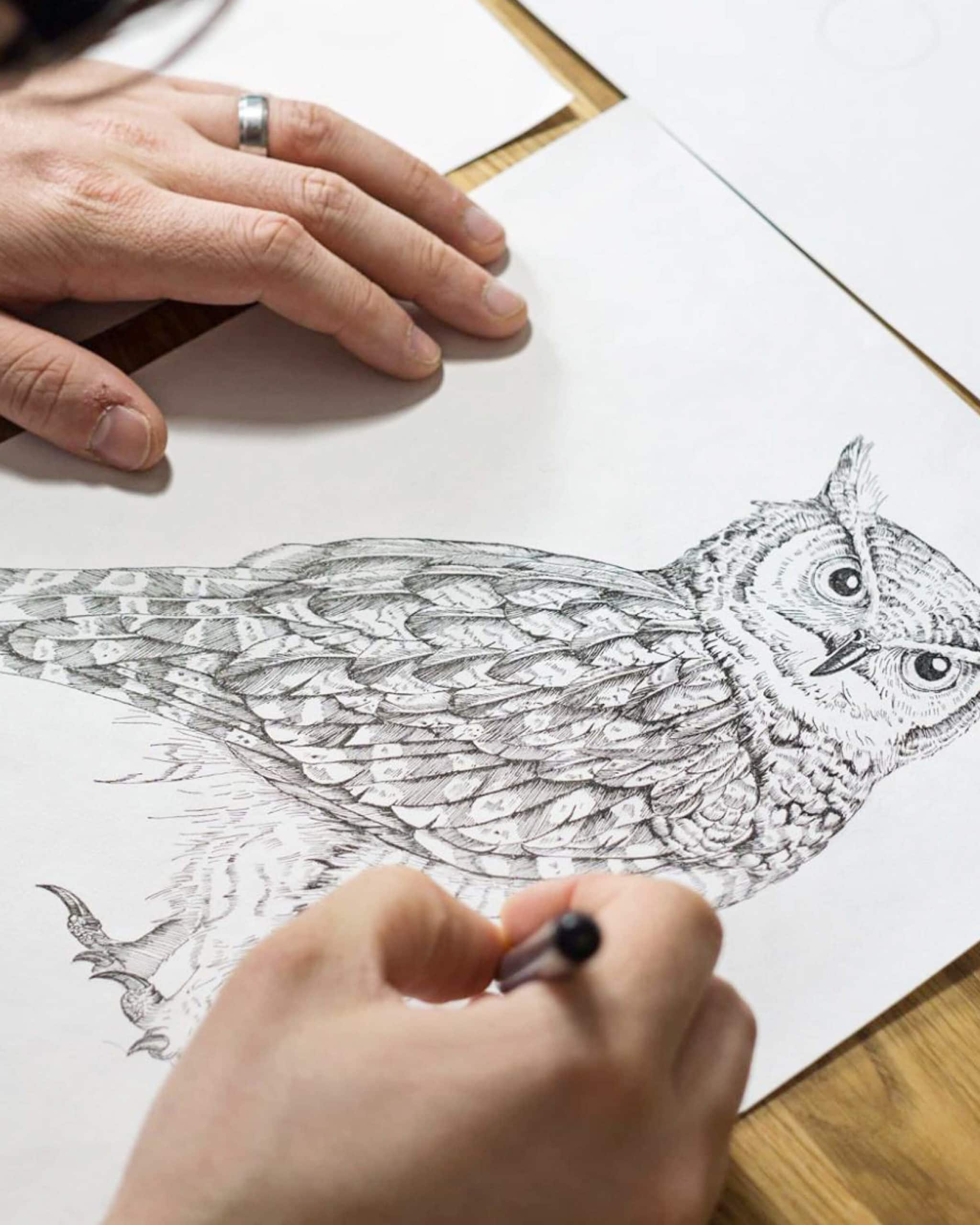
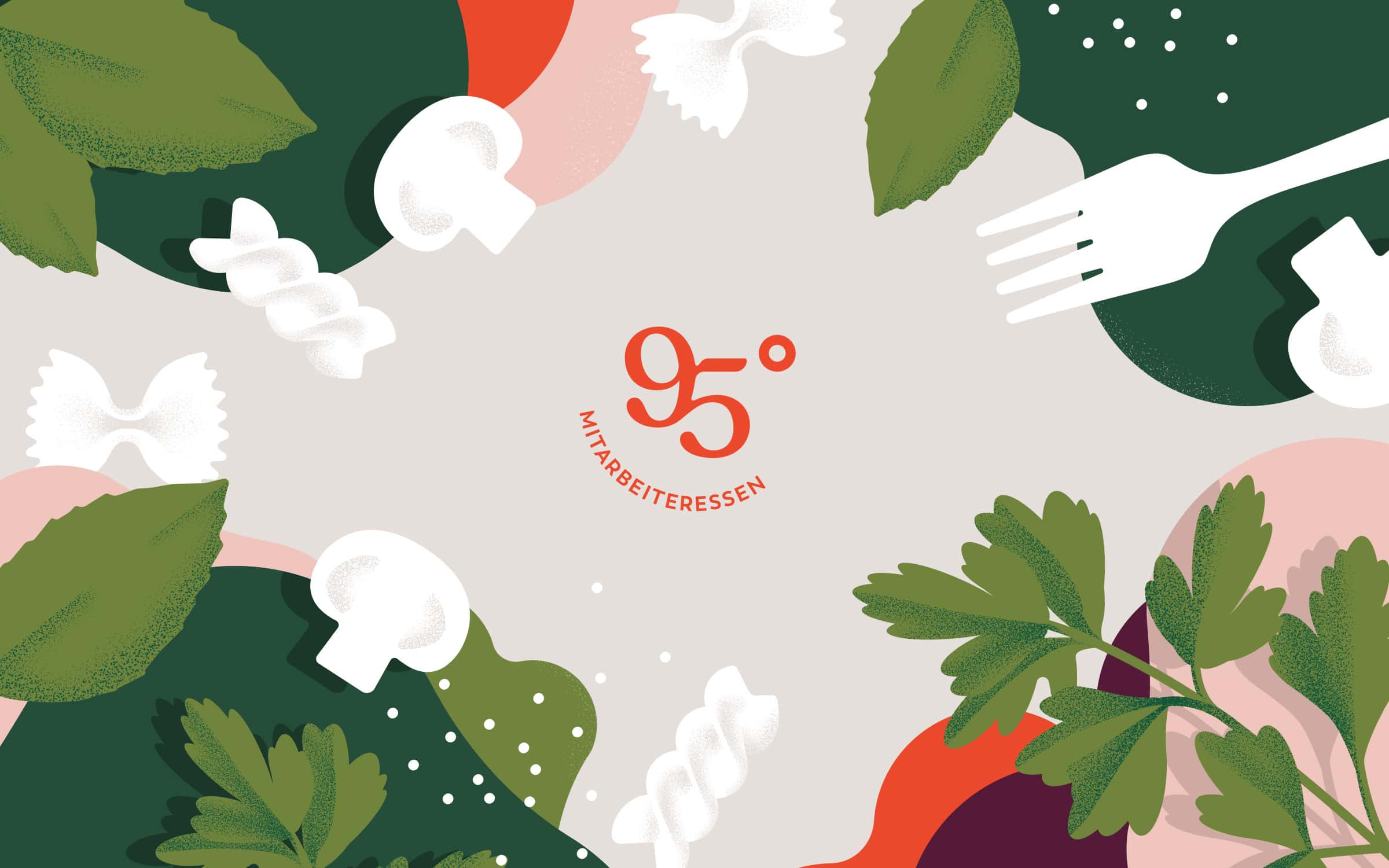
Illustration
Illustration is a powerful tool for conveying complex emotions quickly. It can depict reality in a way that is familiar and delightfully unusual.
Illustrations are good at creating an emotional connection and are a valuable art form for explaining difficult ideas. We work with top international illustrators and know the right, artistic expression for your brand.
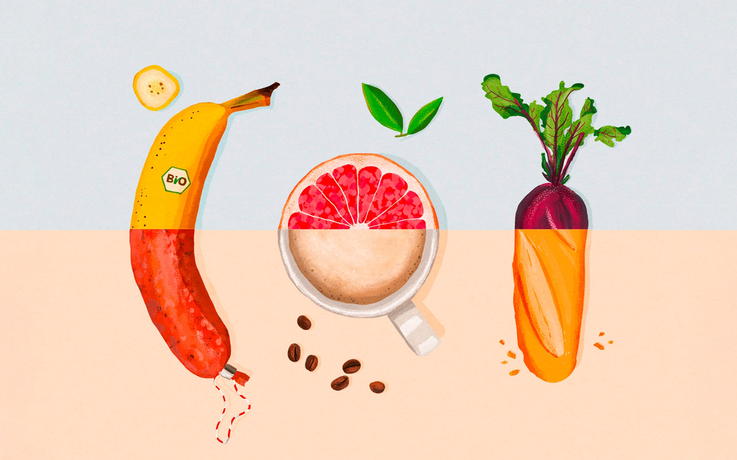

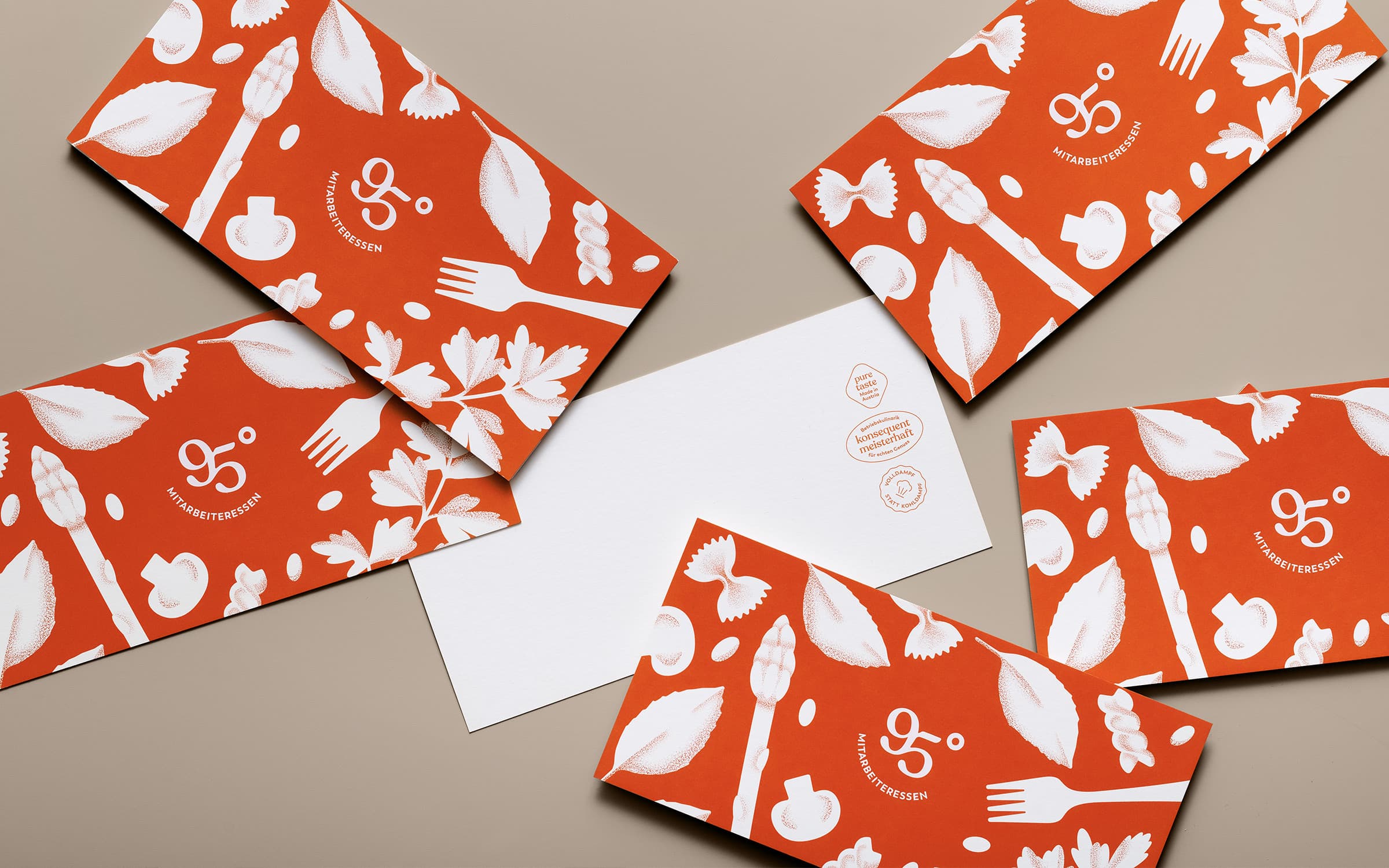
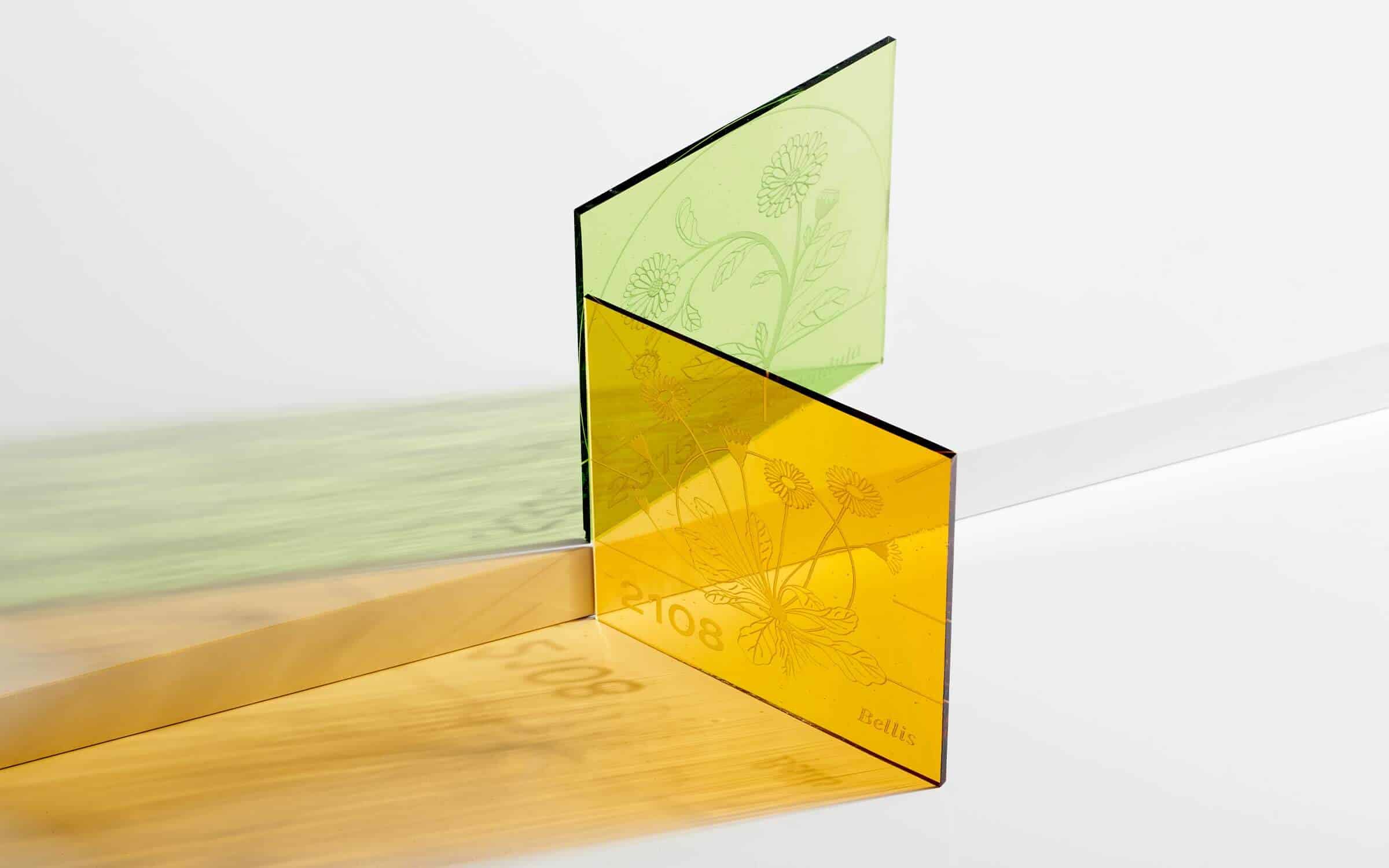
Color Palette
The grass is greener at Solid & Bold: in brand design, colors have the best long-distance effect and recognition. We will light up your brand with the right colors.
Colors evoke emotions and acquire meaning as they are used in a (cultural) context. When choosing corporate colors, consider the following: What colors do your competitors use? Is there an industry-typical color? Do you already identify with a color, and does it contribute to your brand identity and your creative guiding principle?
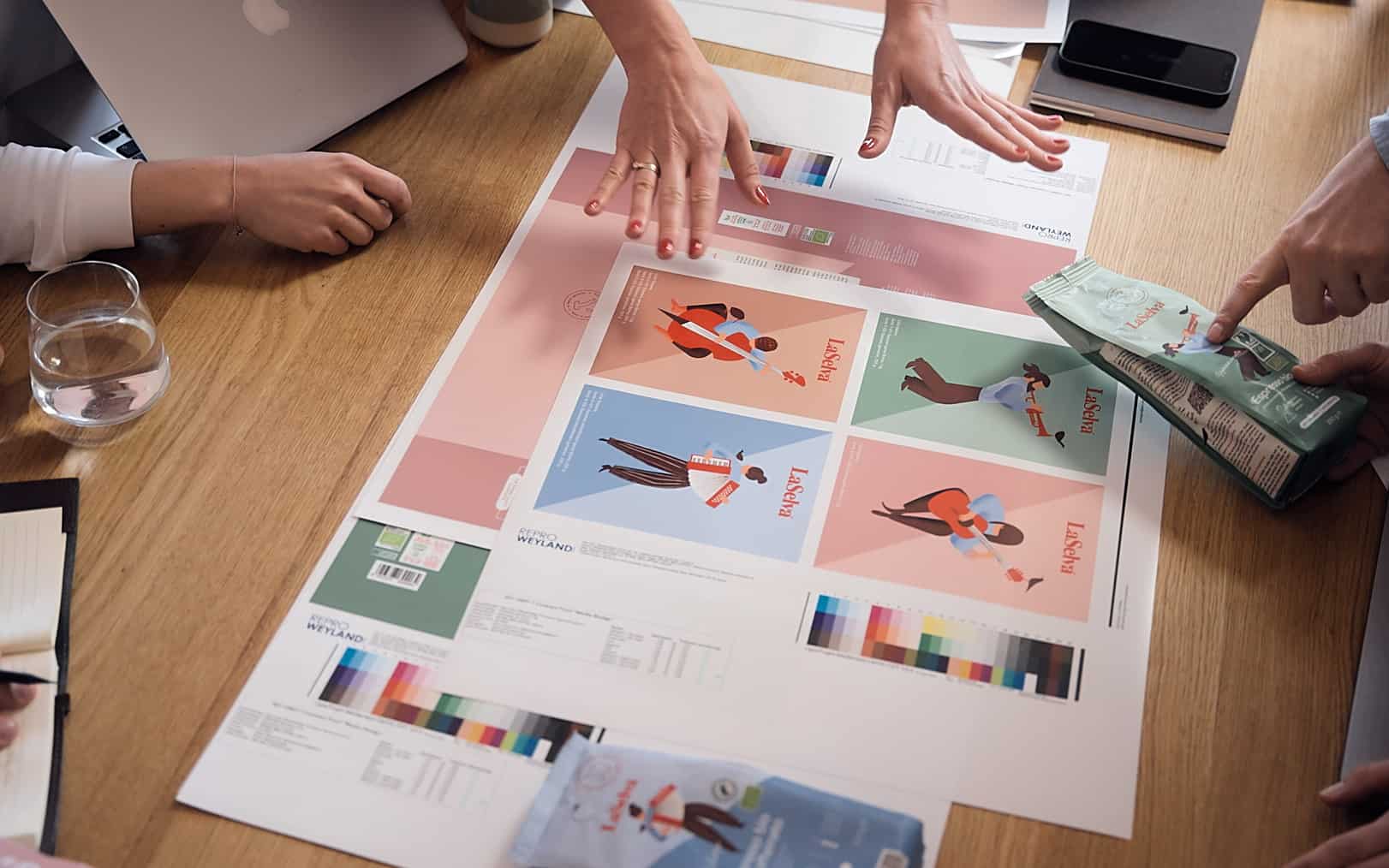
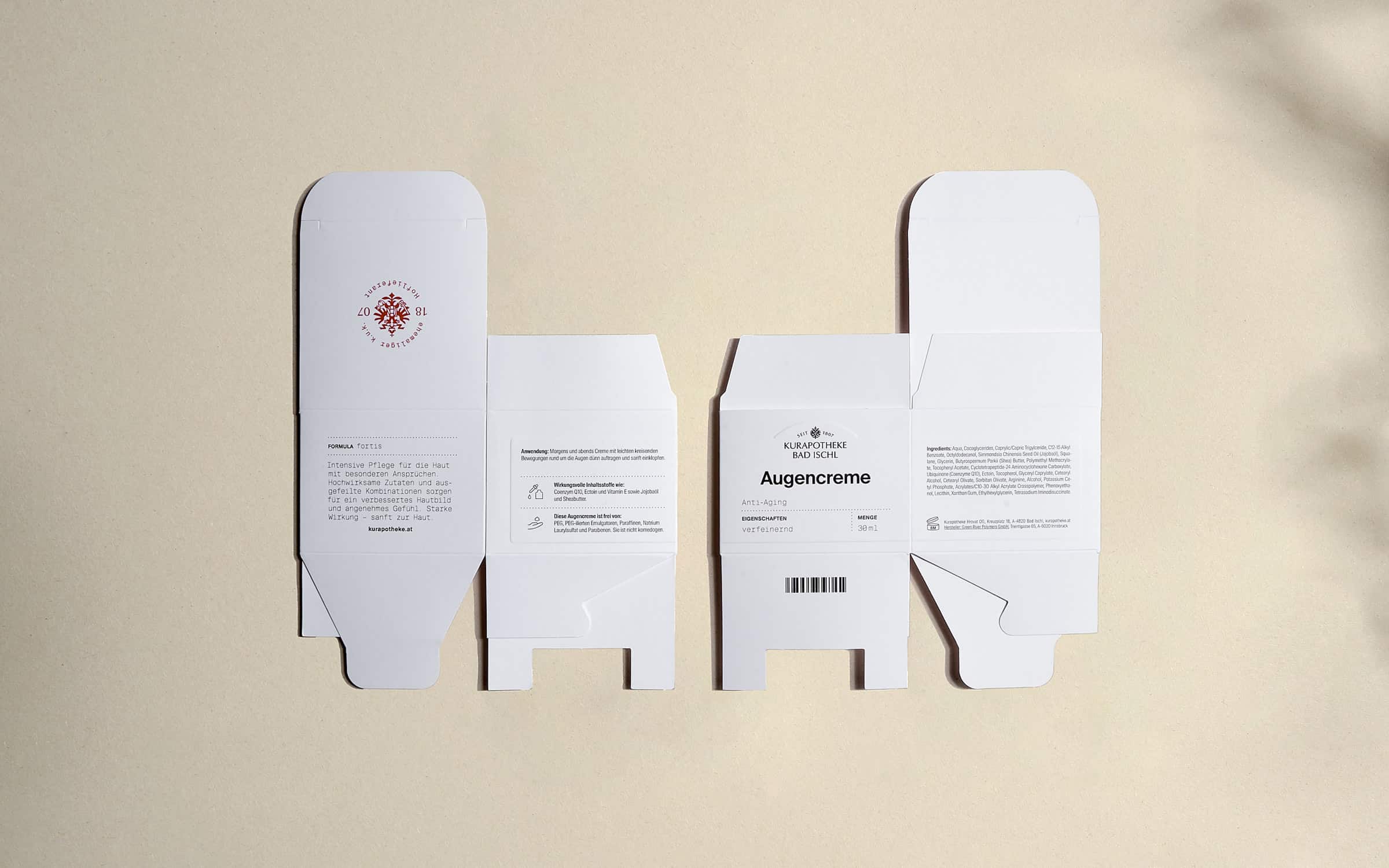
Color proofs for package design

LaSelva Packaging Design
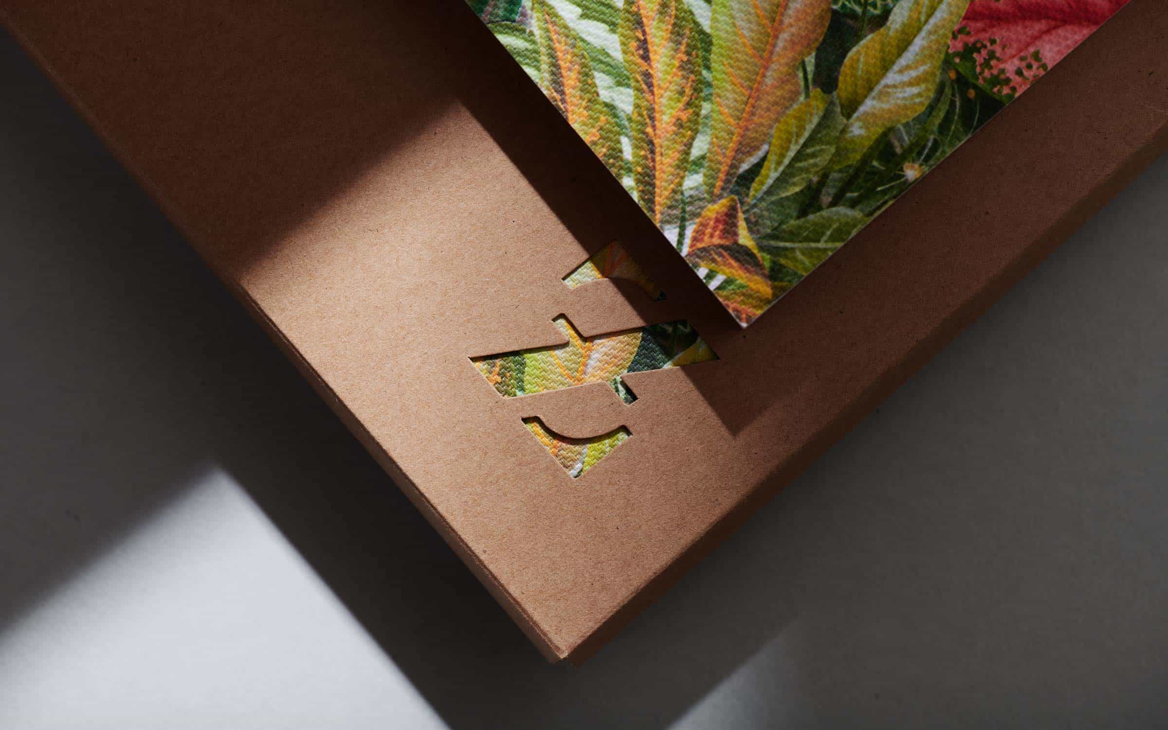
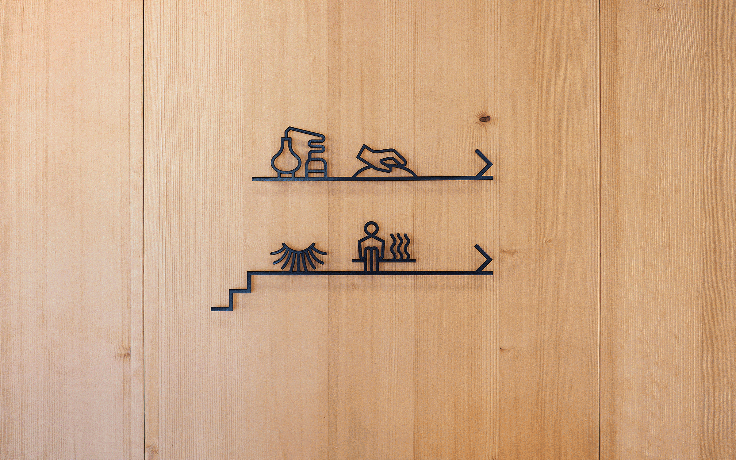
Design Language
Imagine the Adidas Adilette – this sport sandal reveals the importance of design language for a brand. Design language provides structure and order and can even replace the logo when popular.
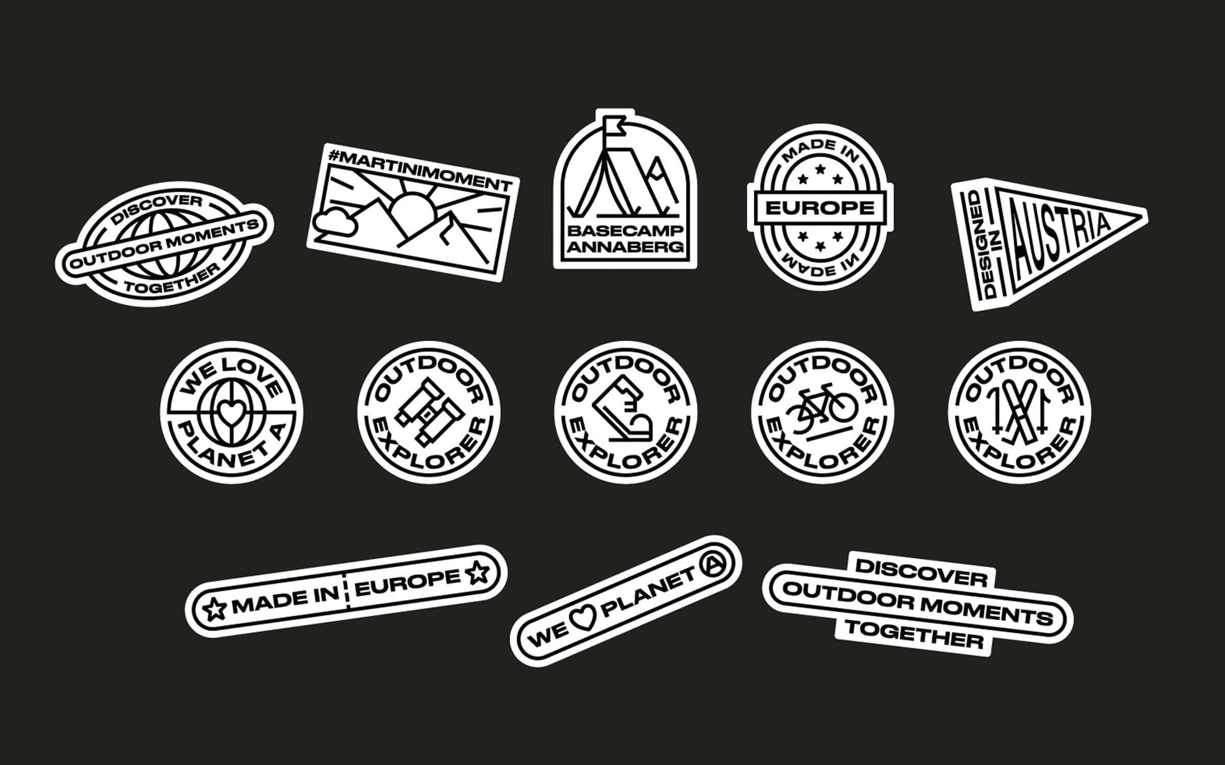
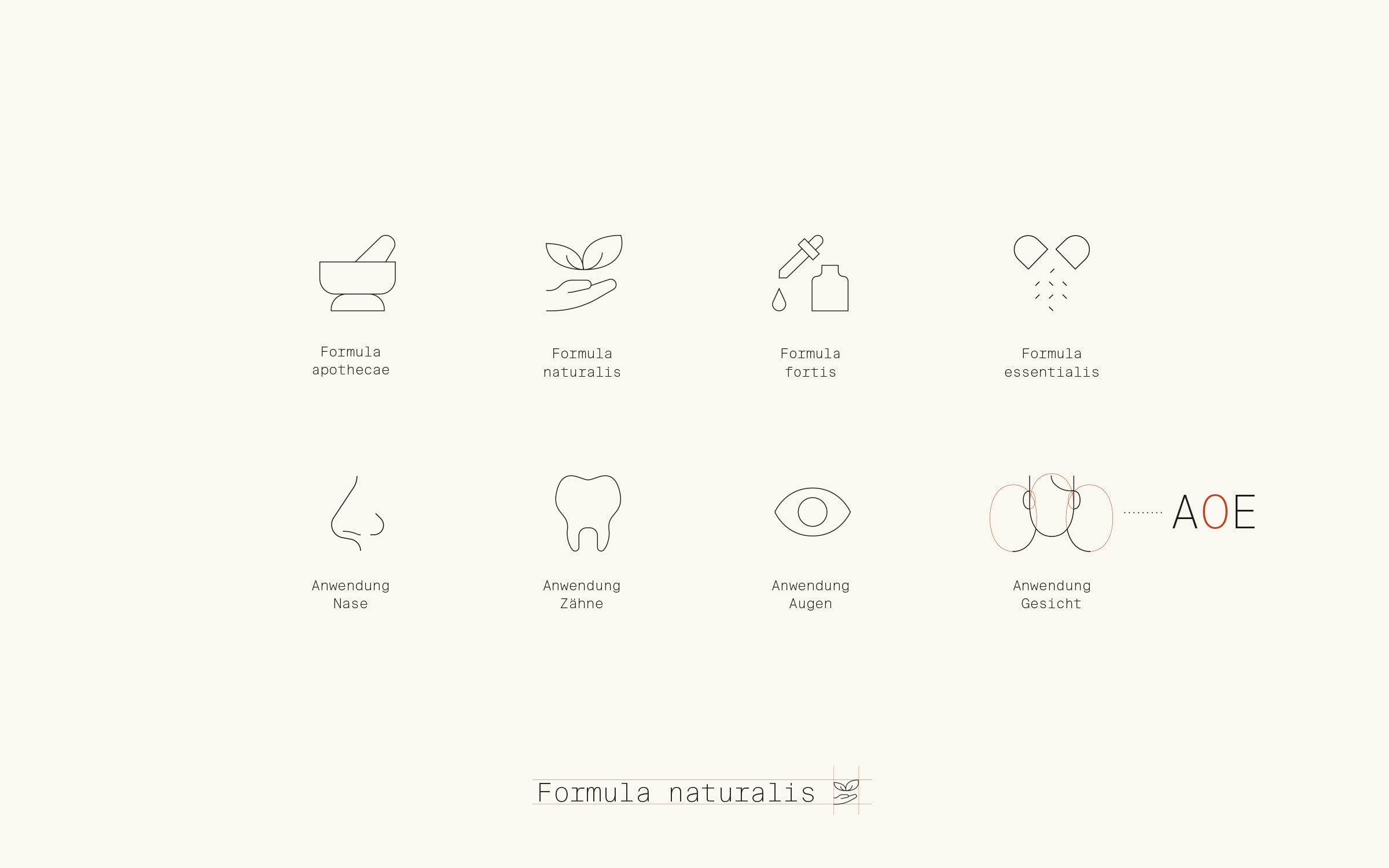
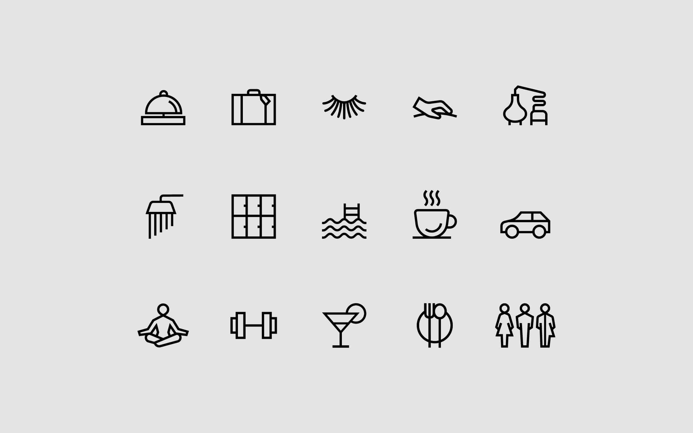
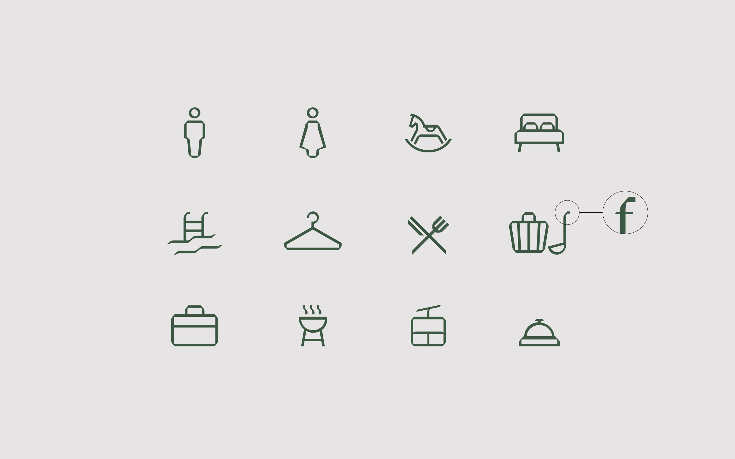
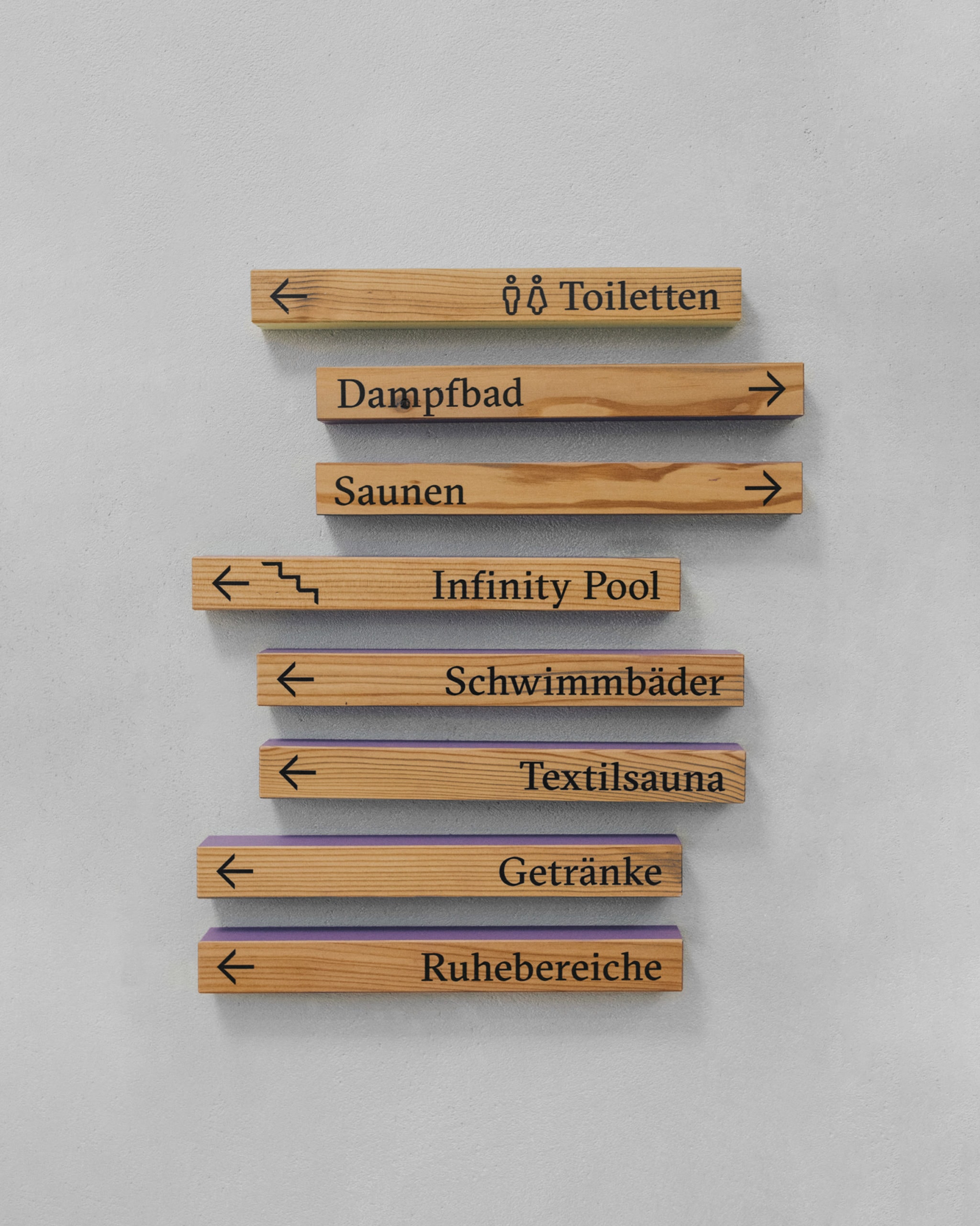
Iconography emphasizes content, supports readability, and differentiates. Using icons gives your brand an informative and individual character for quick and universal communication. This is critical to have, especially with signage. How else would you find a hotel toilet in Calcutta…?
Material Concept
Fact: We are serious materialists. We fight for emotive brands dressed in untreated wood, waxed bronze, or the finest micro-embossed paper.
Motion Branding
Do the logomotion with me! Design can be dynamic. Logos can be animated, and layouts can move. Animation communicates effectively and directly with your audience.
The improving technology of screens and faster processors offers great potential for motion or kinetic branding. This is an effective way for companies to gain market share and engage their audience. The world moves – and so should your brand.